Somewhere Interiors
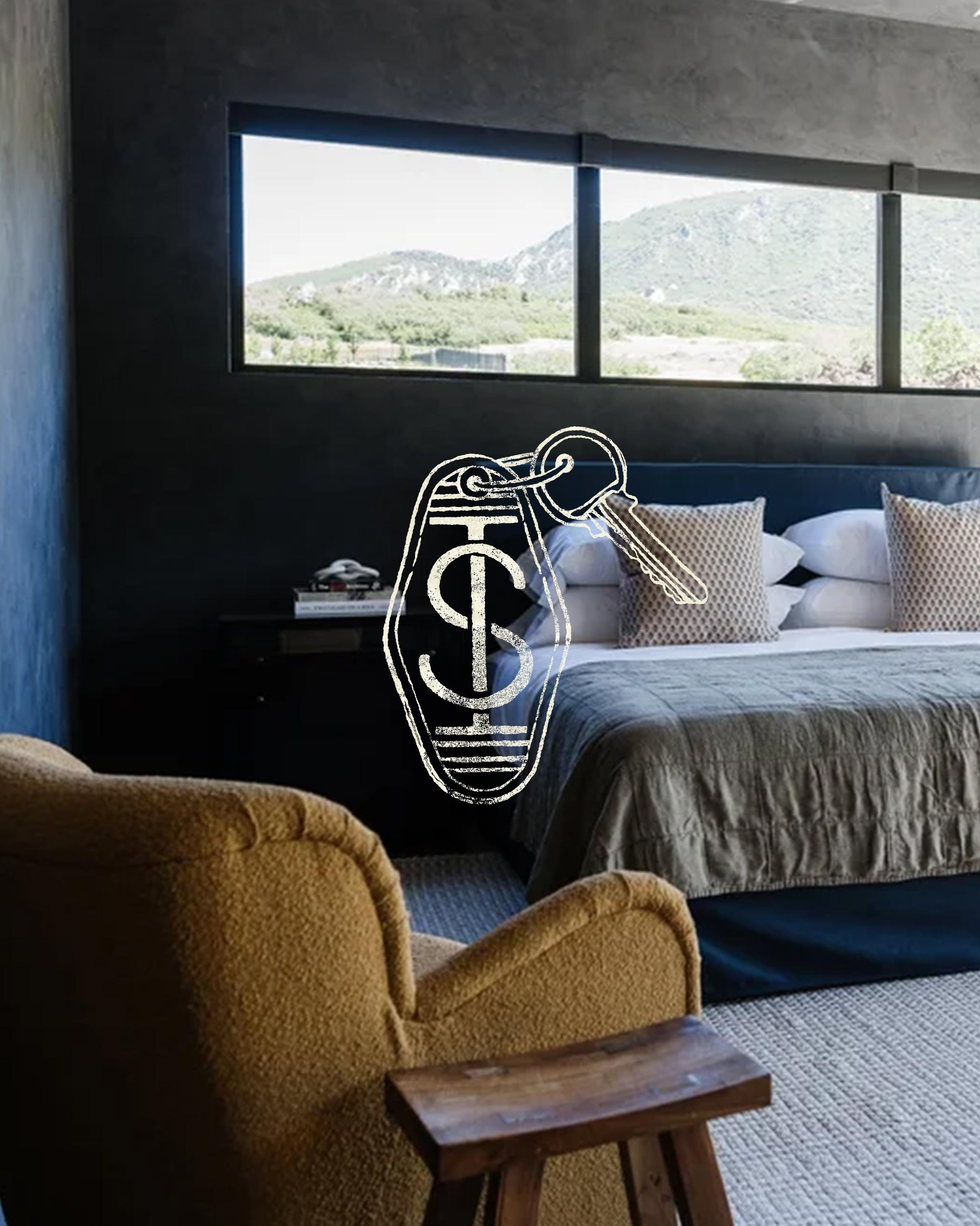
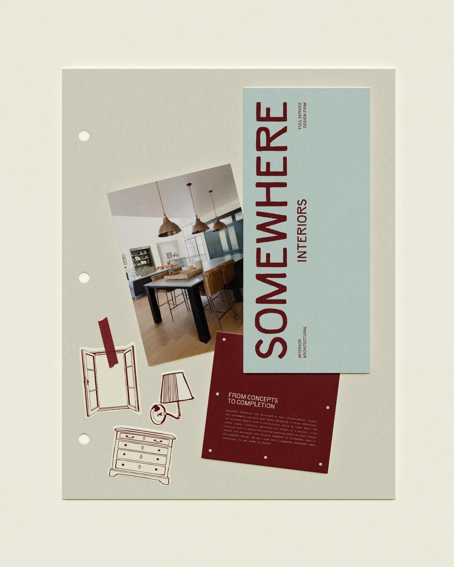
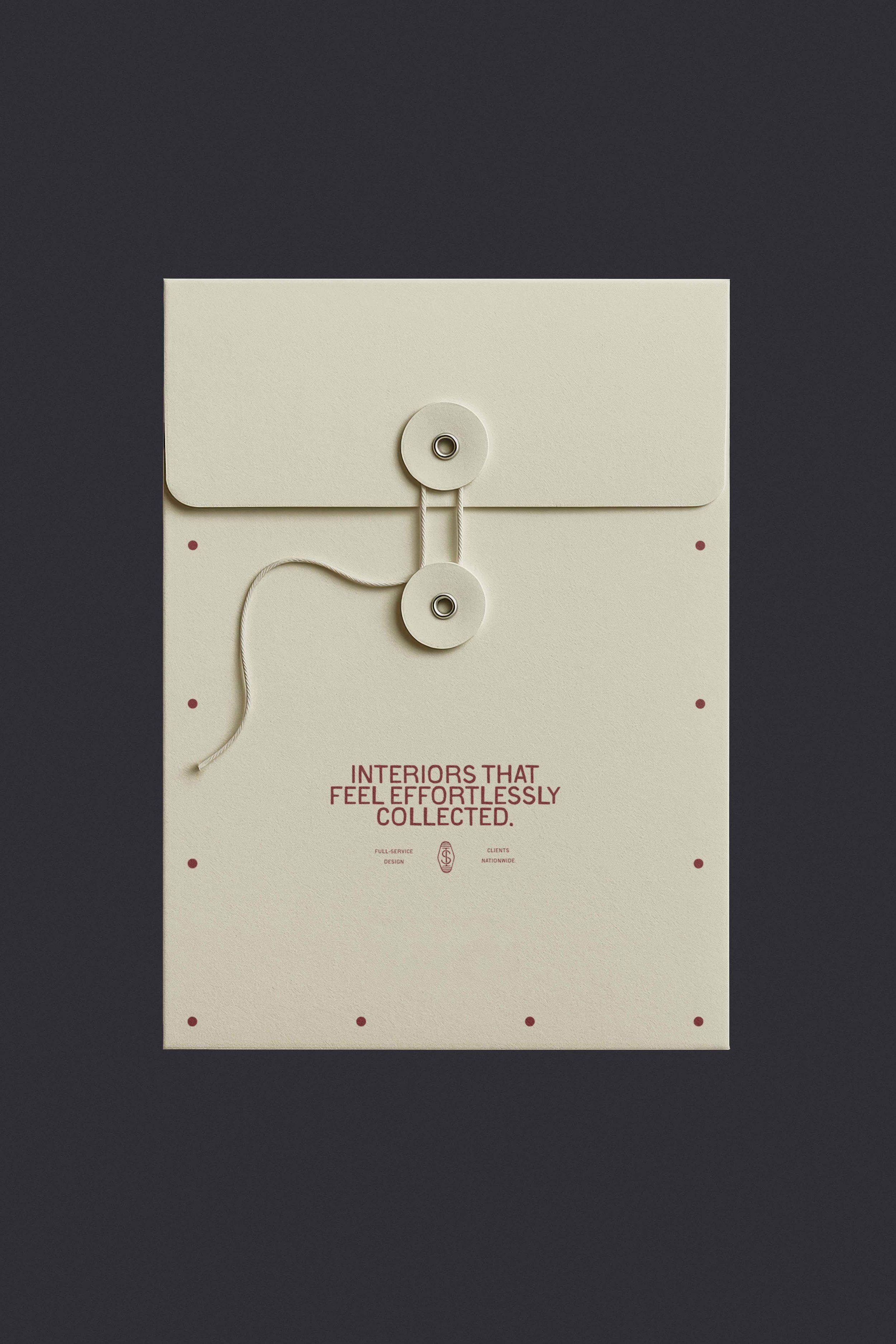
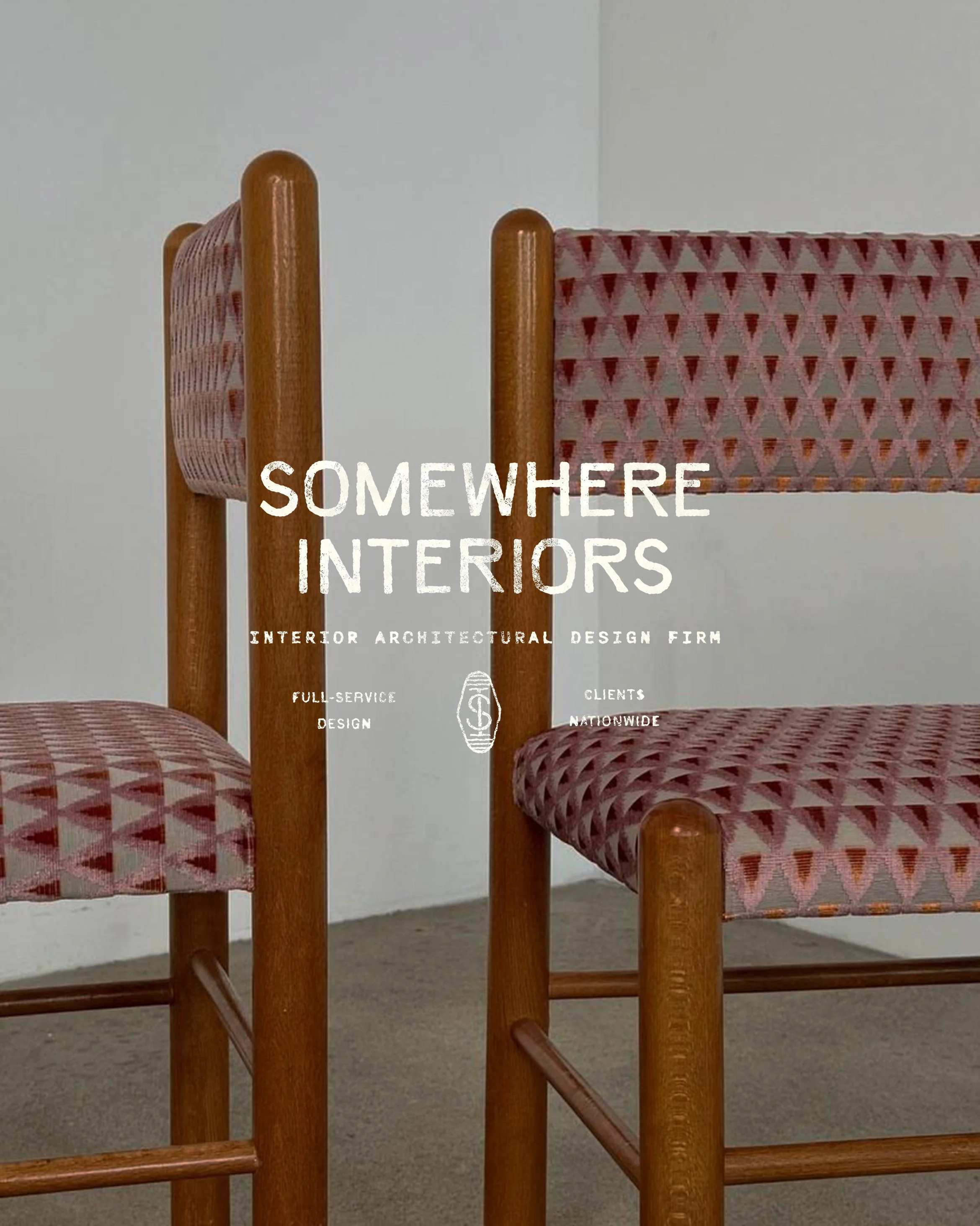
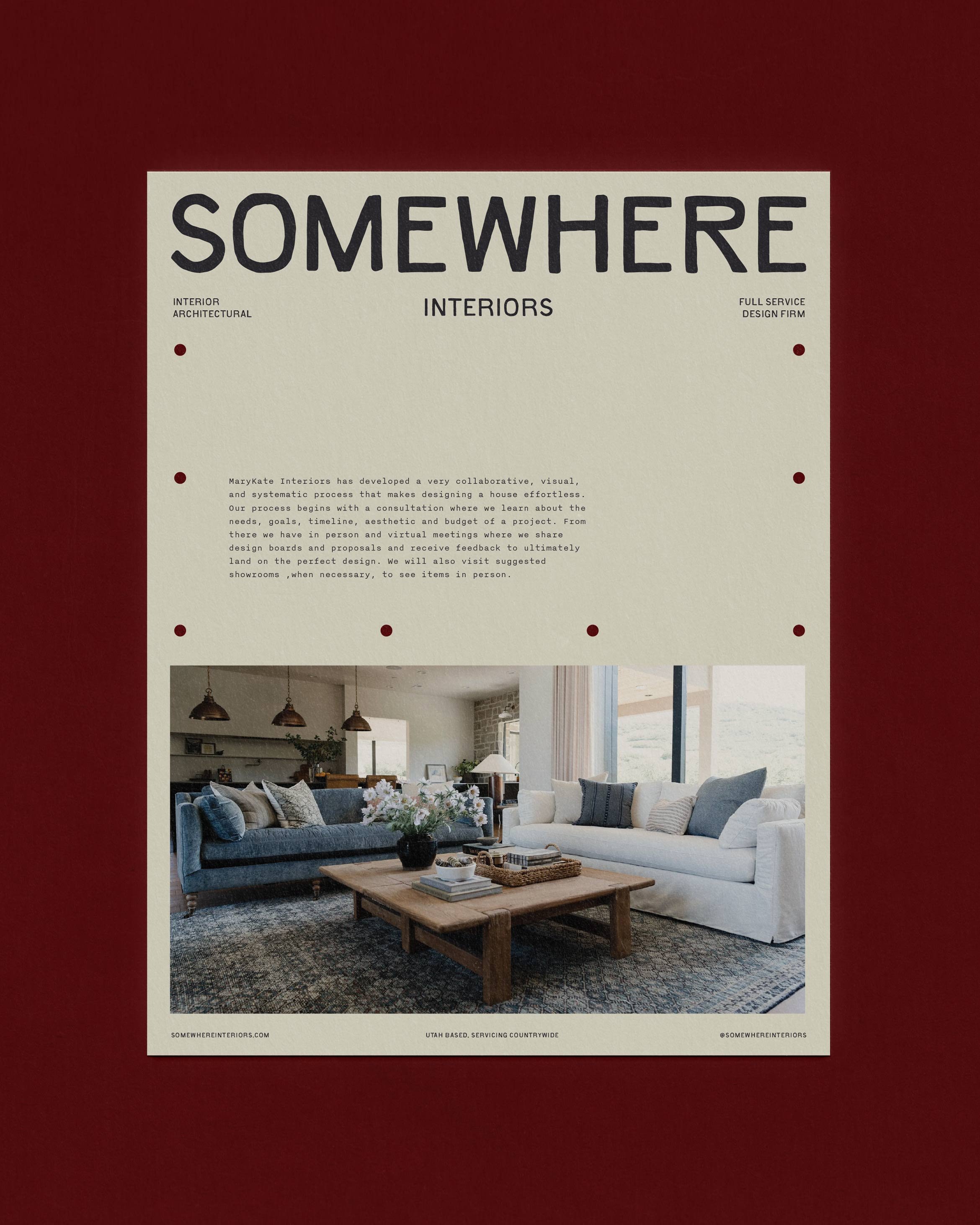
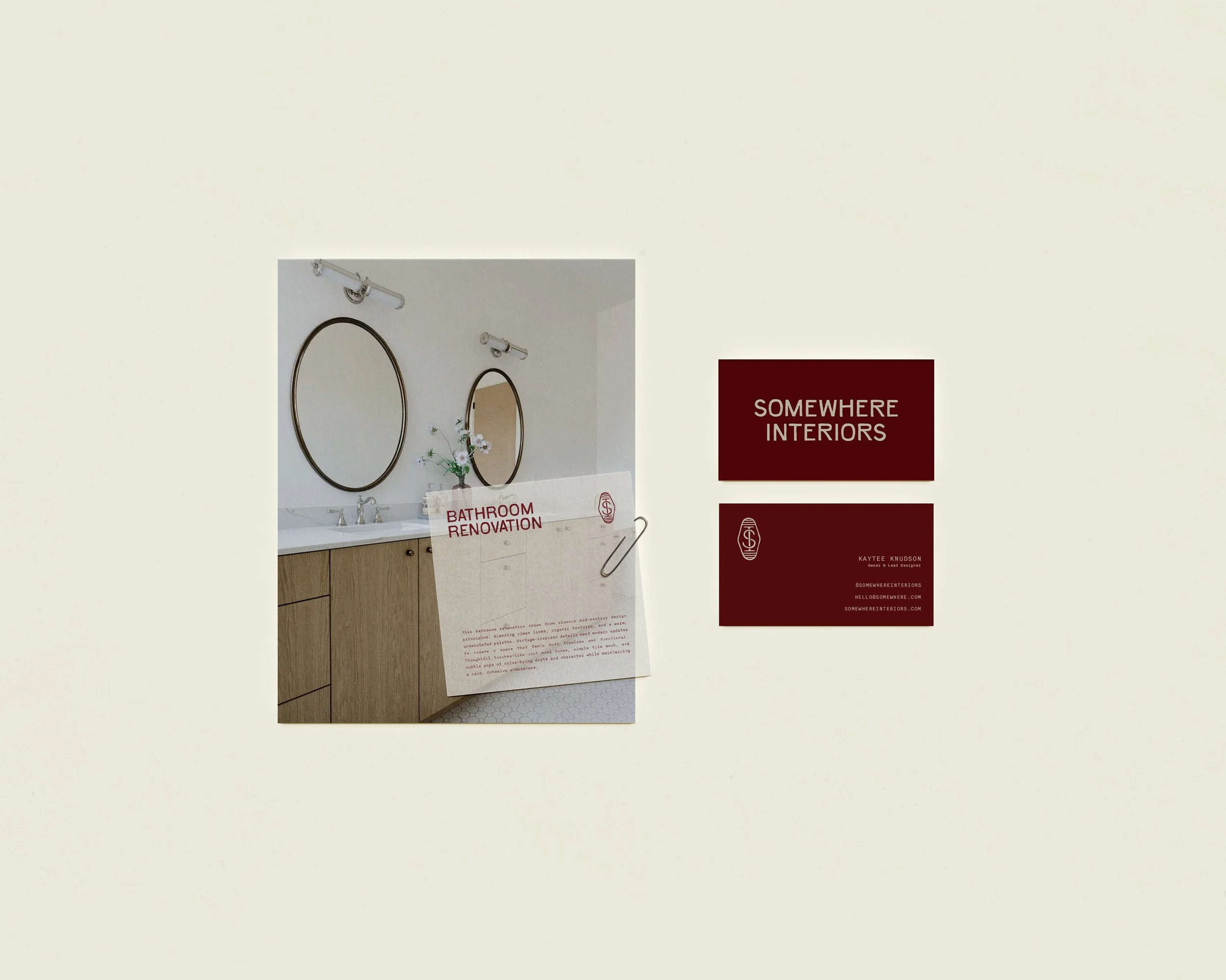
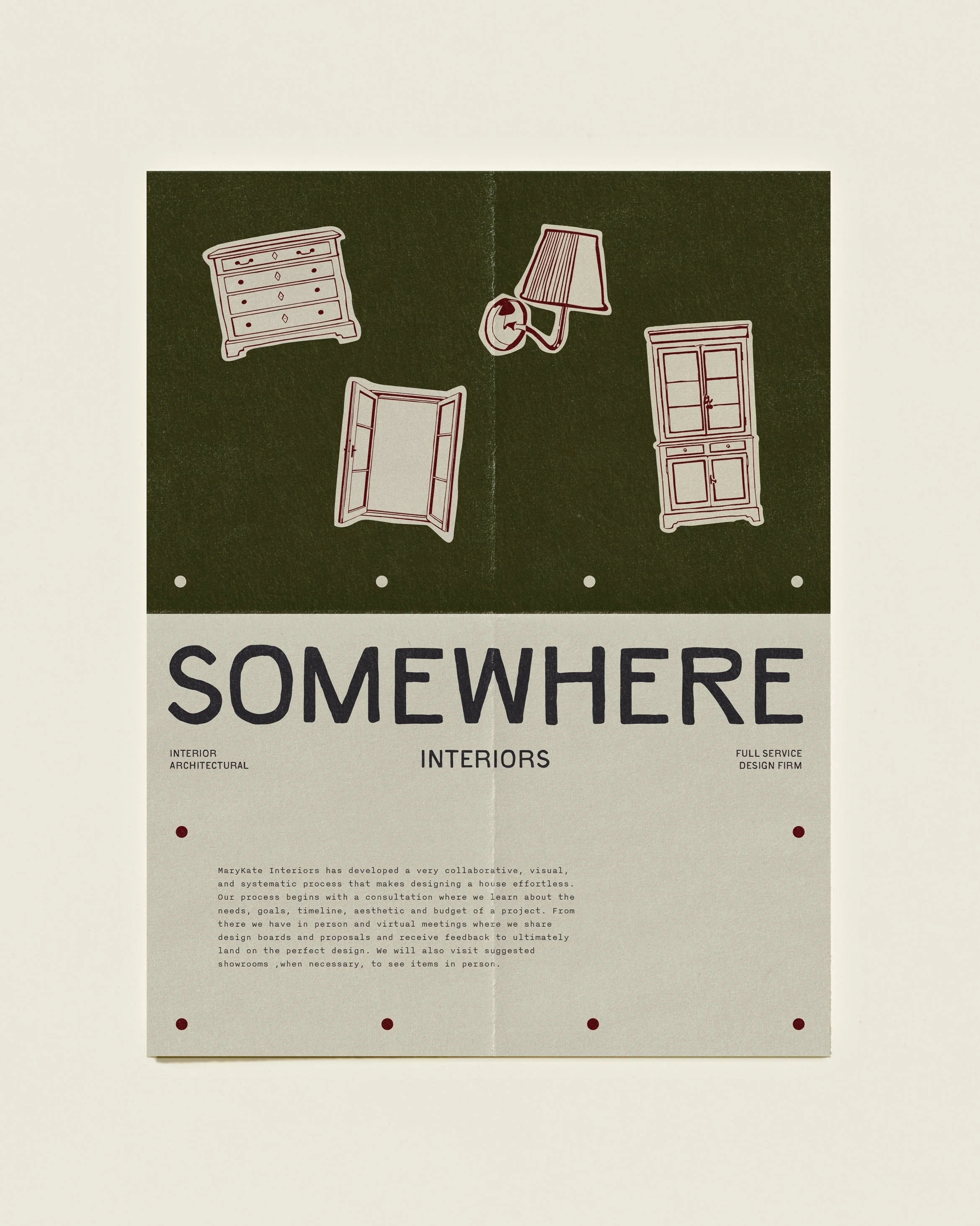
Somewhere Interiors was built for the mom who is done choosing between a home that works and a home that feels like hers. We started with that belief and let it shape every decision in the rebrand. The wordmark is set in a refined serif with generous tracking, grounded by a secondary sans-serif that keeps it from feeling precious. The palette pulls from the physical materials of a well-lived home: Bone and Linen for the walls that hold everything, Eggplant and Chocolate for depth and weight, Wine as the note of warmth that turns a room from cold to considered. We built the visual language around the idea that nostalgia is not a style, it is a feeling, something rooted and recognizable without being dated. Every type choice, every color decision pointed back to the same thing: a brand that listens before it designs. You walk away feeling like someone finally asked the right questions.
servicesBrand Strategy & Positioning
Visual Identity
Logo Design
Brand Assets
Brand Guidelines
detailsInterior Design Industry Rebrand
2026
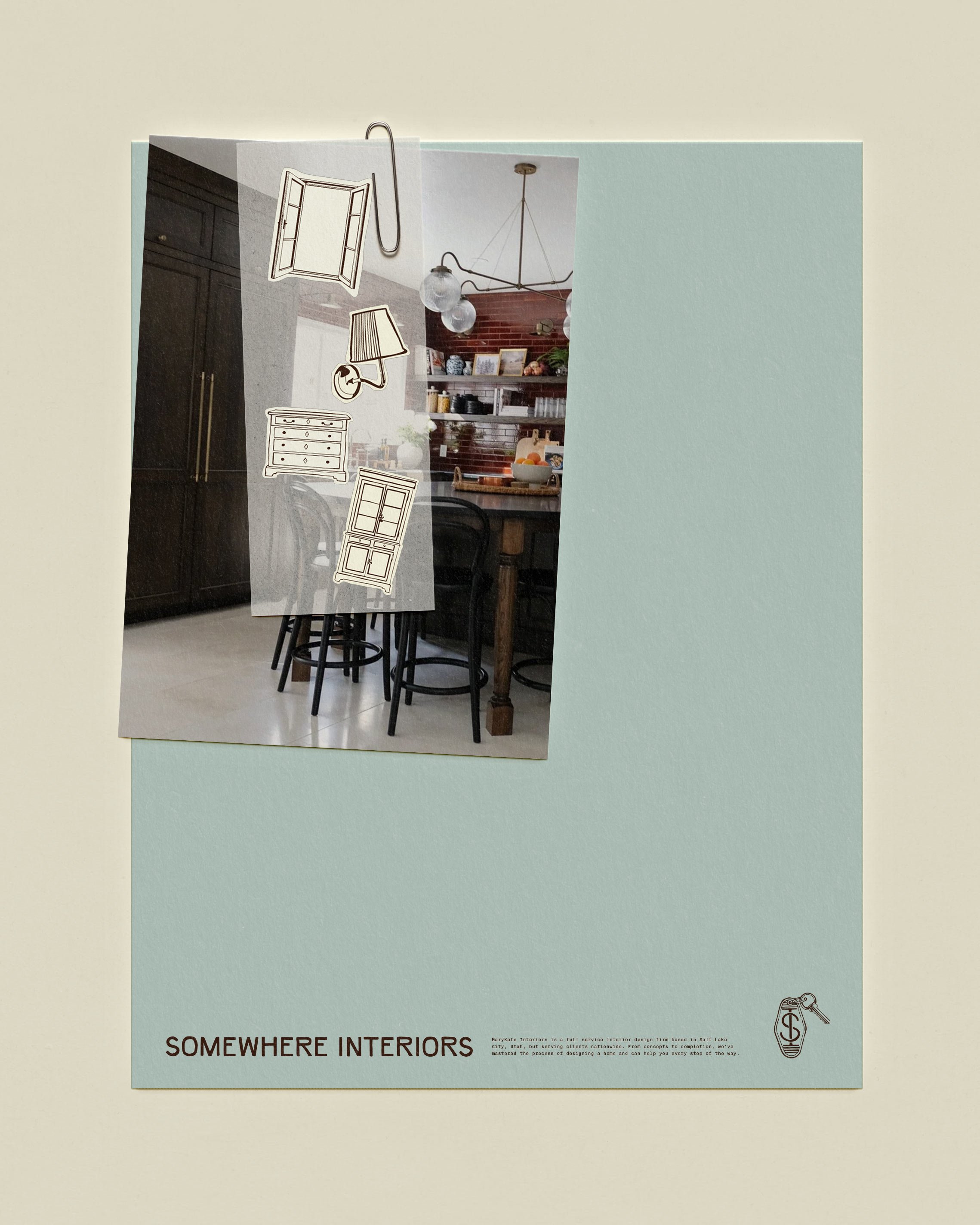

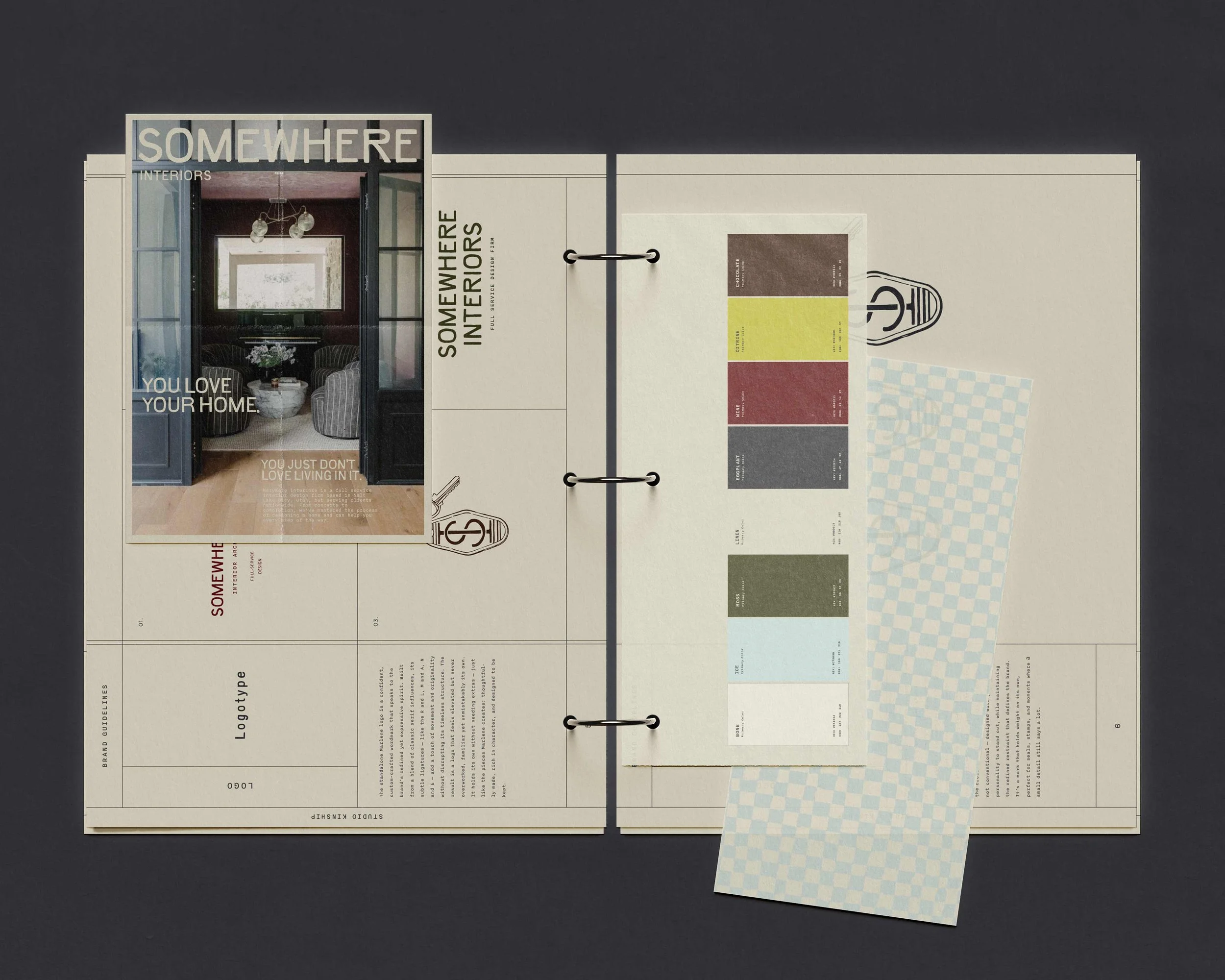
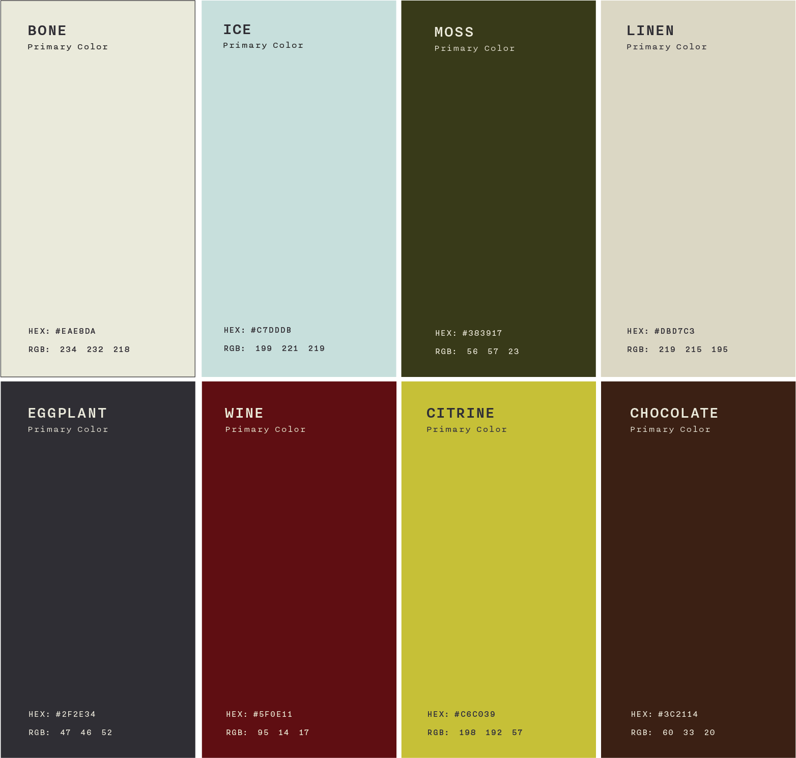
Color PaletteThe palette was drawn from the materials and memories at the heart of Somewhere Interiors' world: aged linens, worn wood, dusty kitchen herbs, and the particular warmth of rooms that have been lived in for decades. Bone and Linen serve as the primary backgrounds, quiet and breathable, the kind of off-white that reads as cream in morning light. Eggplant and Chocolate anchor the typography, deep and grounded without going cold. Moss and Wine carry the personality, one earthy and rooted, the other rich and a little unexpected. Ice offers a soft counterpoint, cool enough to keep the warmth from tipping precious. Citrine arrives sparingly, a flicker of something bright against all that depth. Used generously in the neutrals and with intention everywhere else, the palette holds together the way a well-designed room does: nothing fighting for attention, everything earning its place.