Katie Iredale Photography
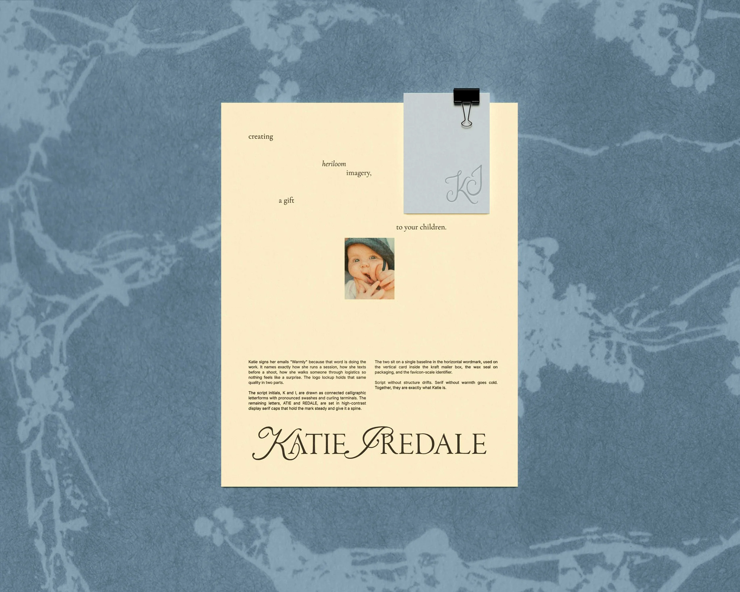
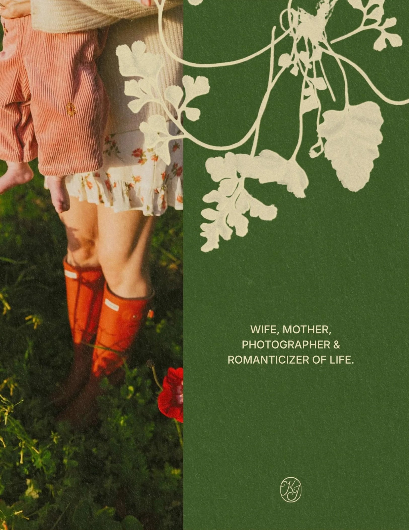
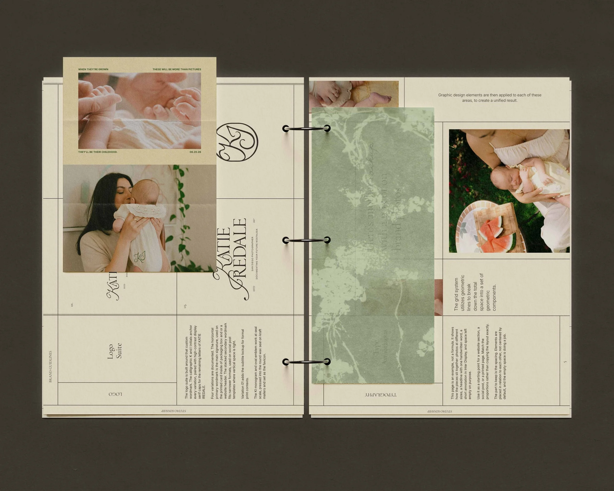
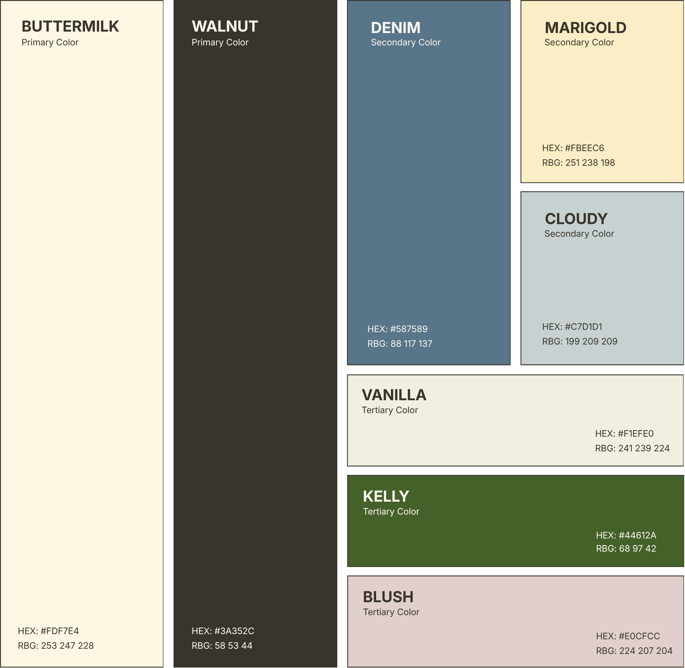
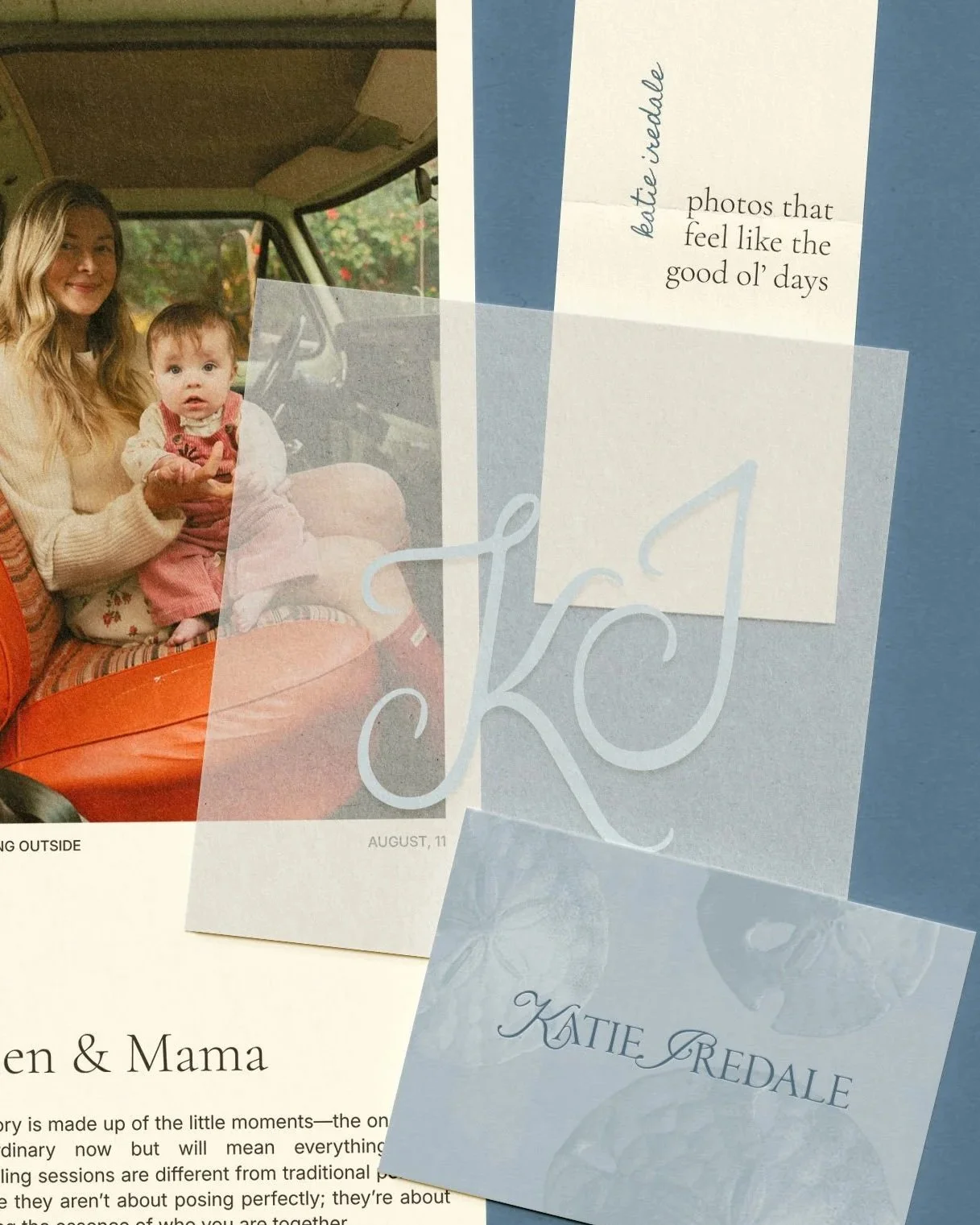
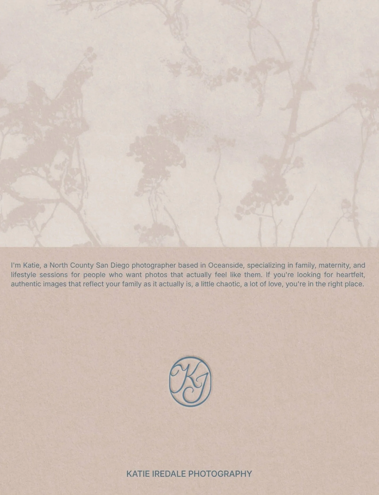
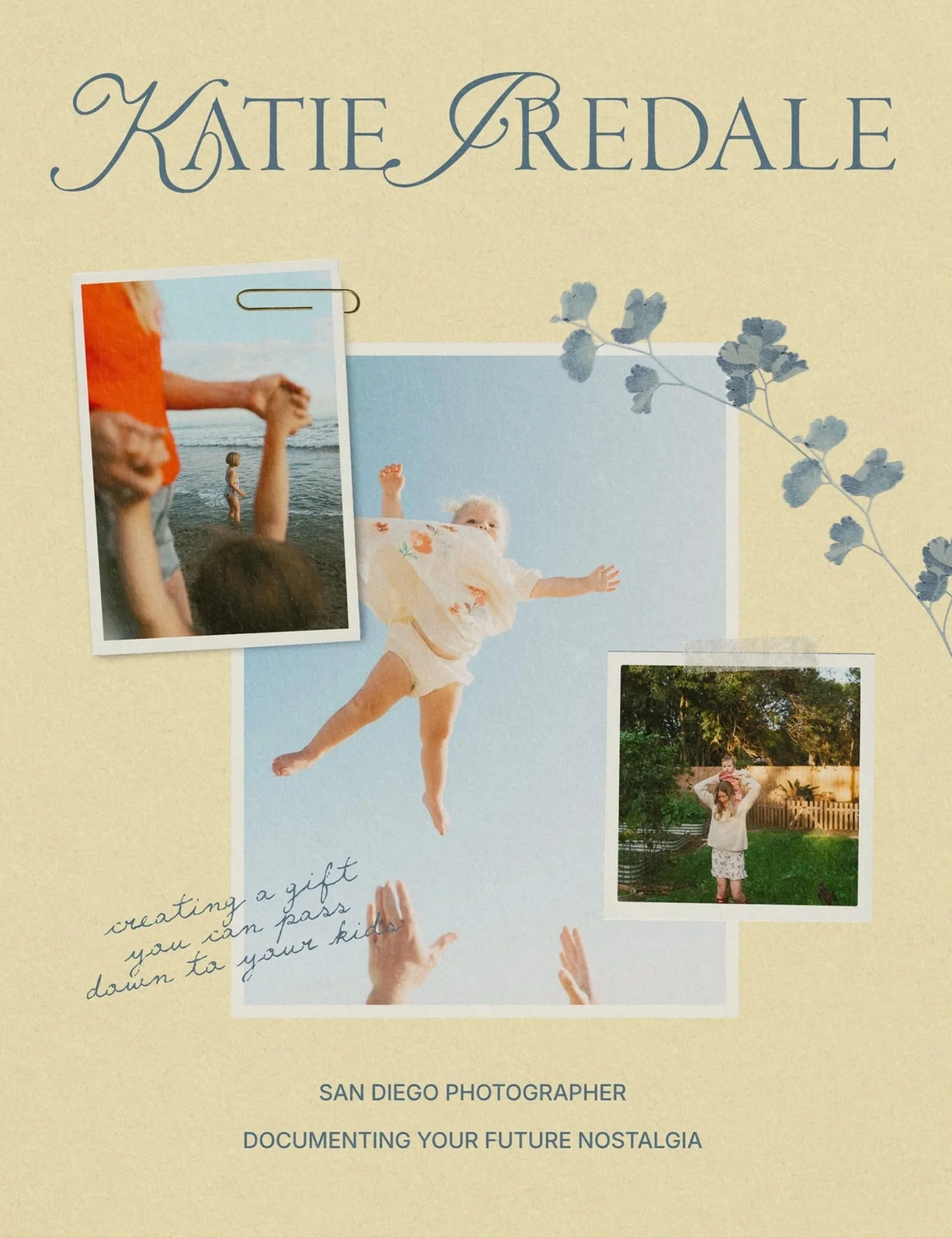
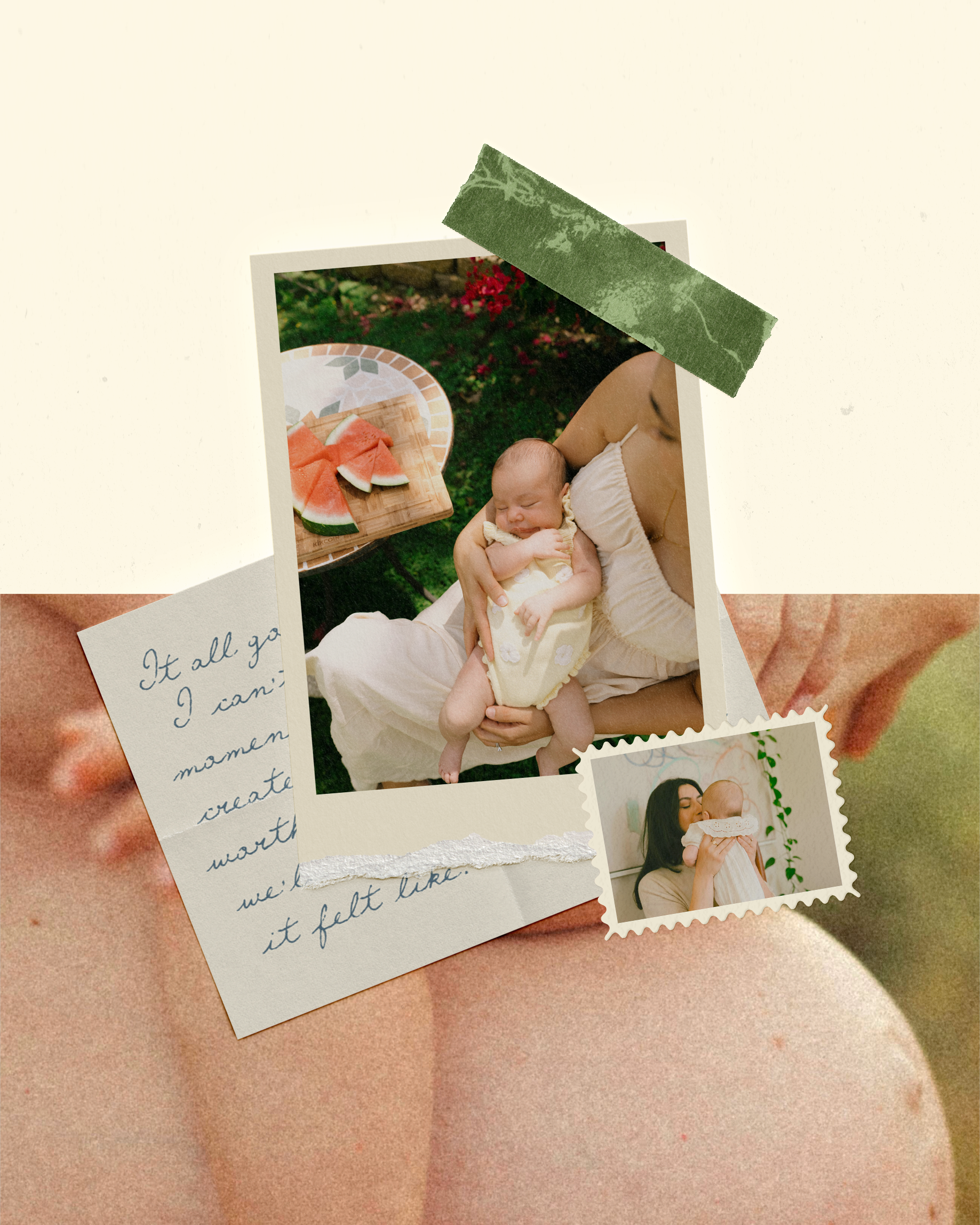
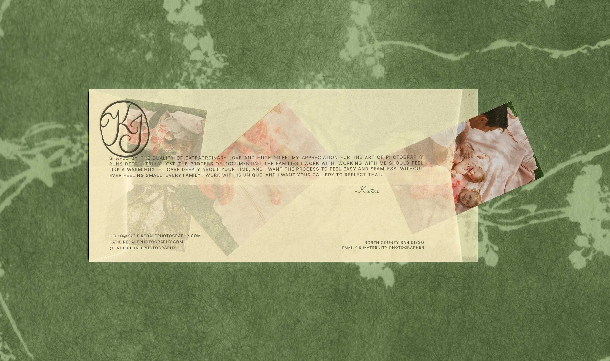
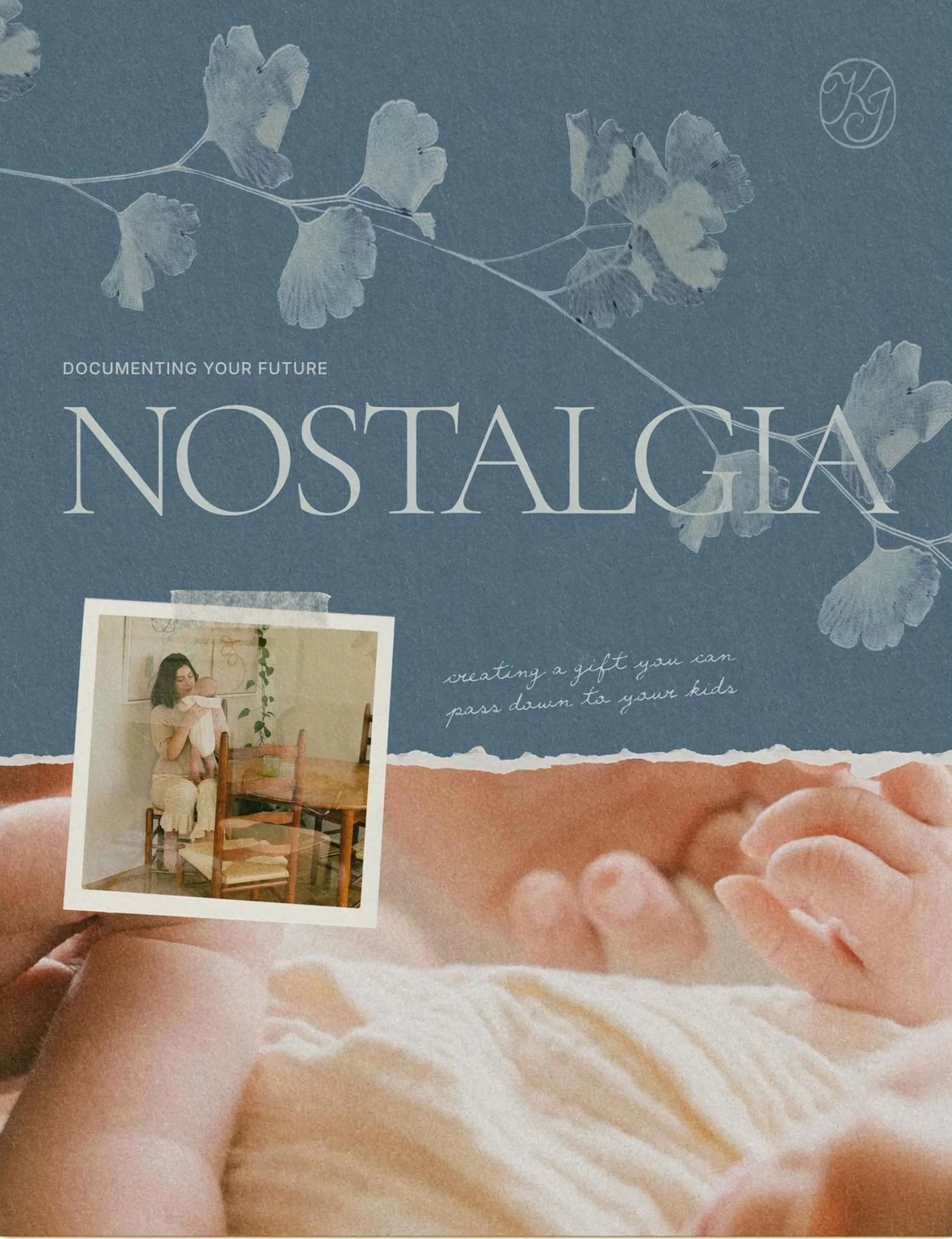
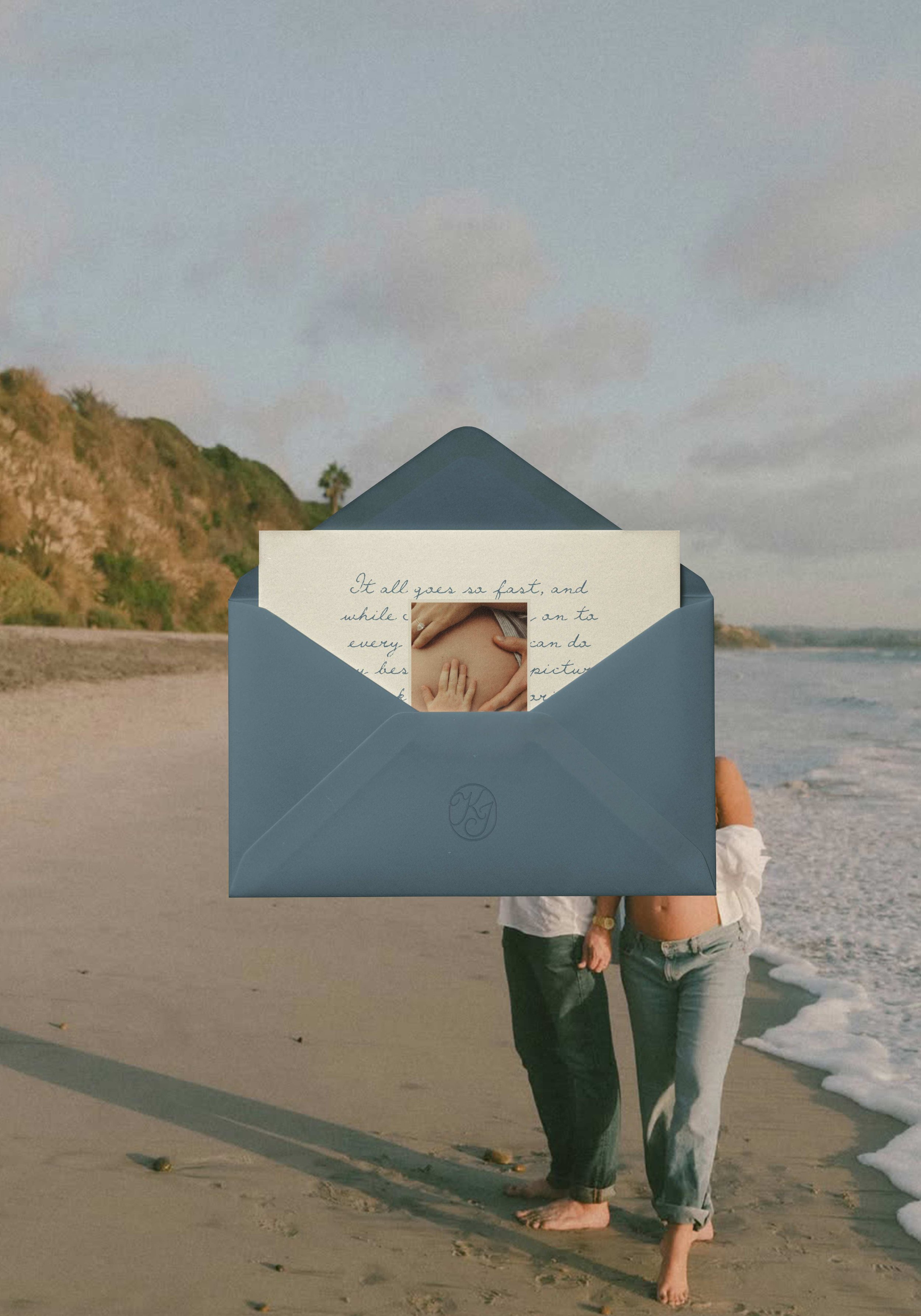
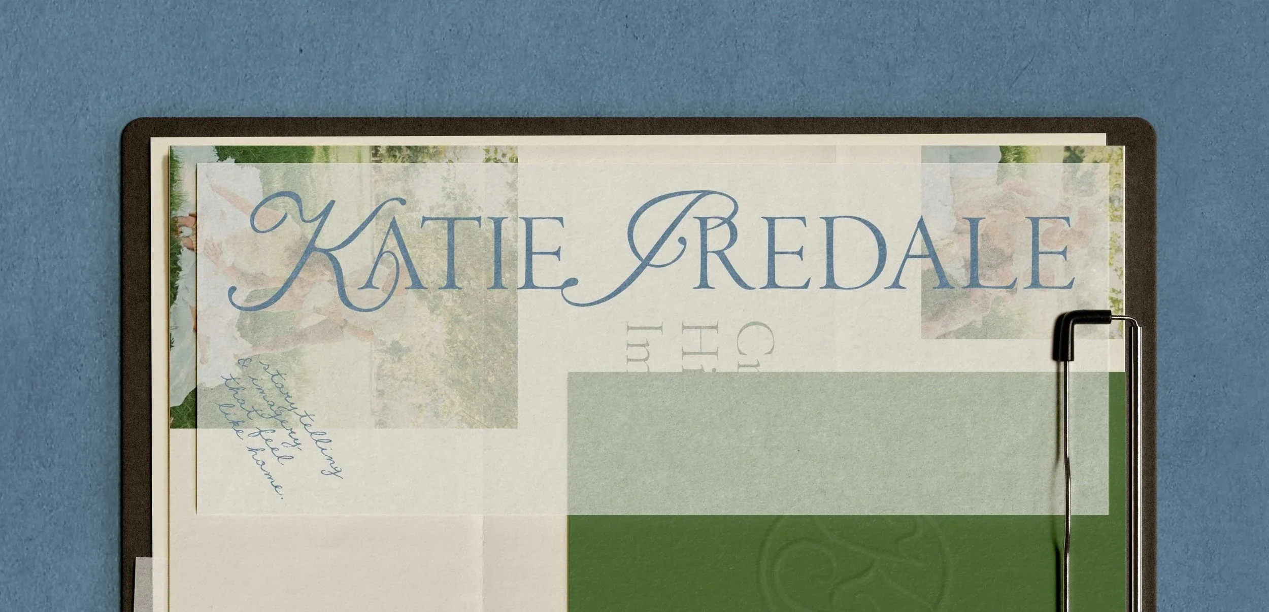
For Katie's brand, the goal was to capture that scrapbook-meets-photo-album feeling of flipping back through memories like you're right there again, without tipping into anything busy, scrappy or cheap. I wanted her own personal style to come through everywhere, from her photography to how she actually lives. She loves color and it shows up all over her work, but she'd always been afraid to bring it into her brand, unsure how much was too much or whether it would compete with the photos themselves. So I built a palette of soft neutrals with just a hint of color running through it, plus a small set of signature colors pulled straight from her photography and the coastline around San Diego. I also introduced cyanotype printing to build out her patterns and background elements, a handmade process that gave the nostalgia we were after a creative twist that's hers alone. In the end, the brand holds all of those directions at once: intimate, nostalgic, kept close, and unmistakably Katie. Nostalgic for the people who hire her, and for her too.
servicesBrand Strategy & Positioning
Visual Identity
Logo Design
Brand Assets
Brand Guidelines
detailsPatterns created with Cyanotype Printing & Photoshop combined.