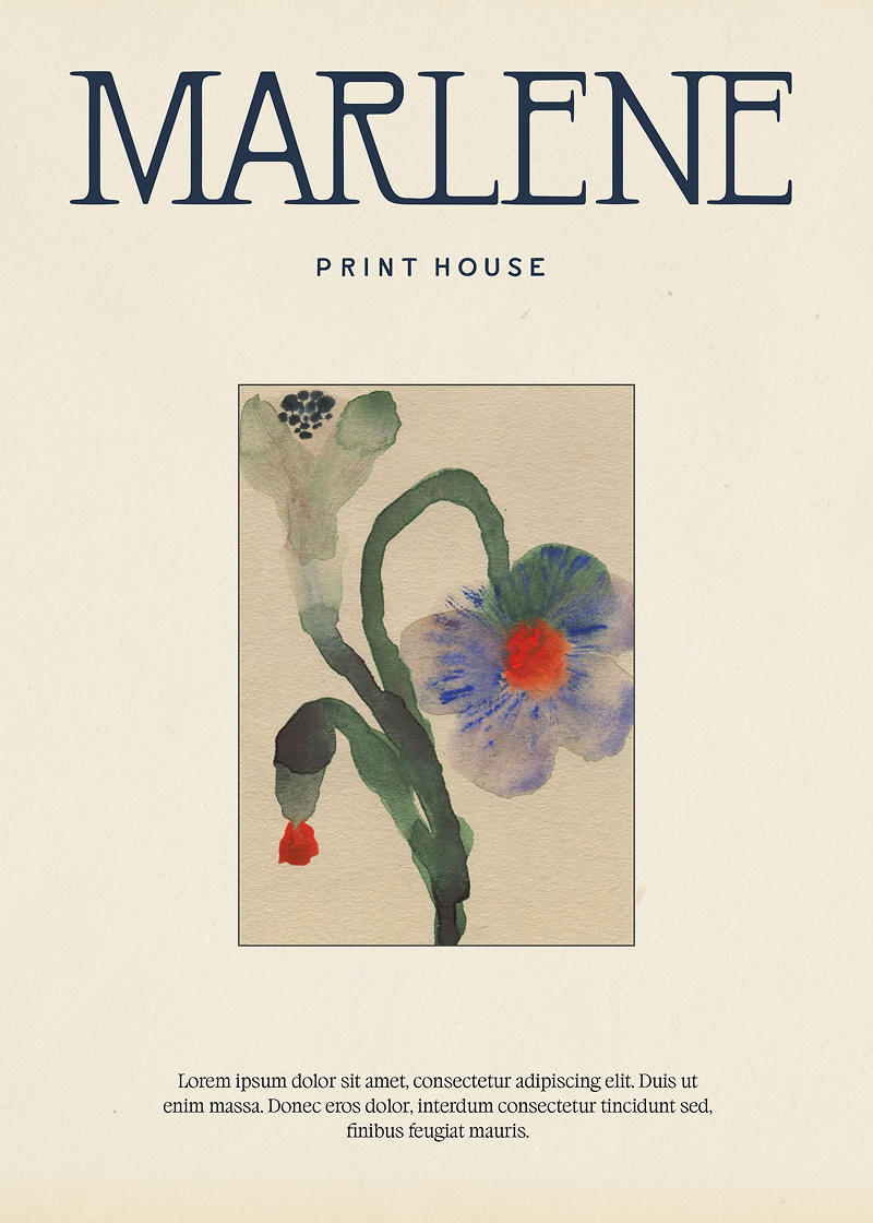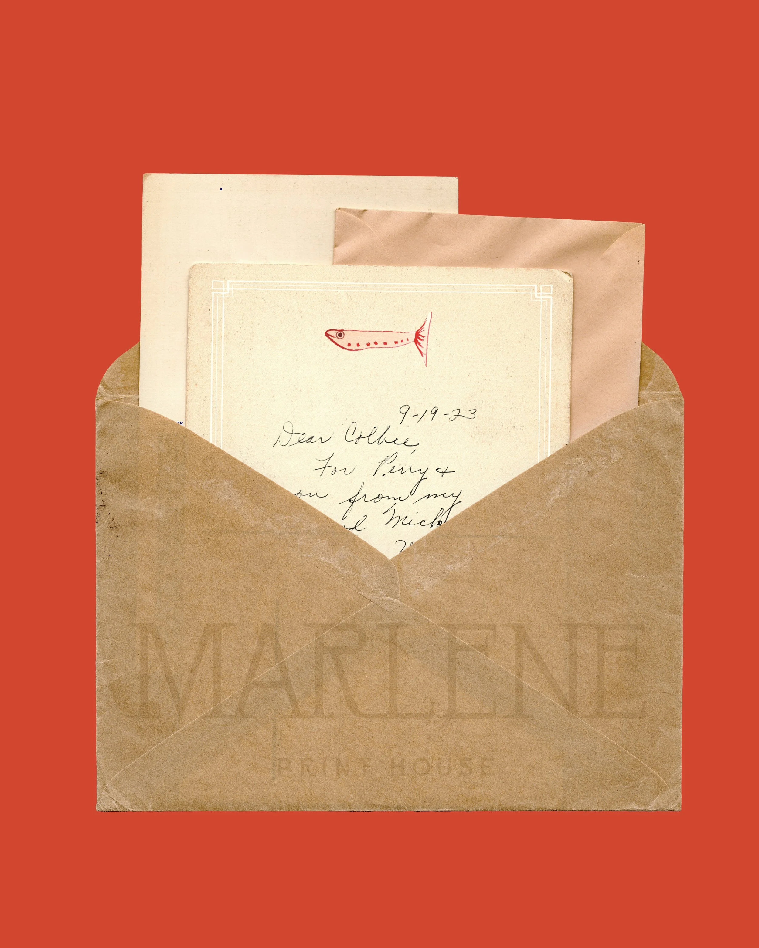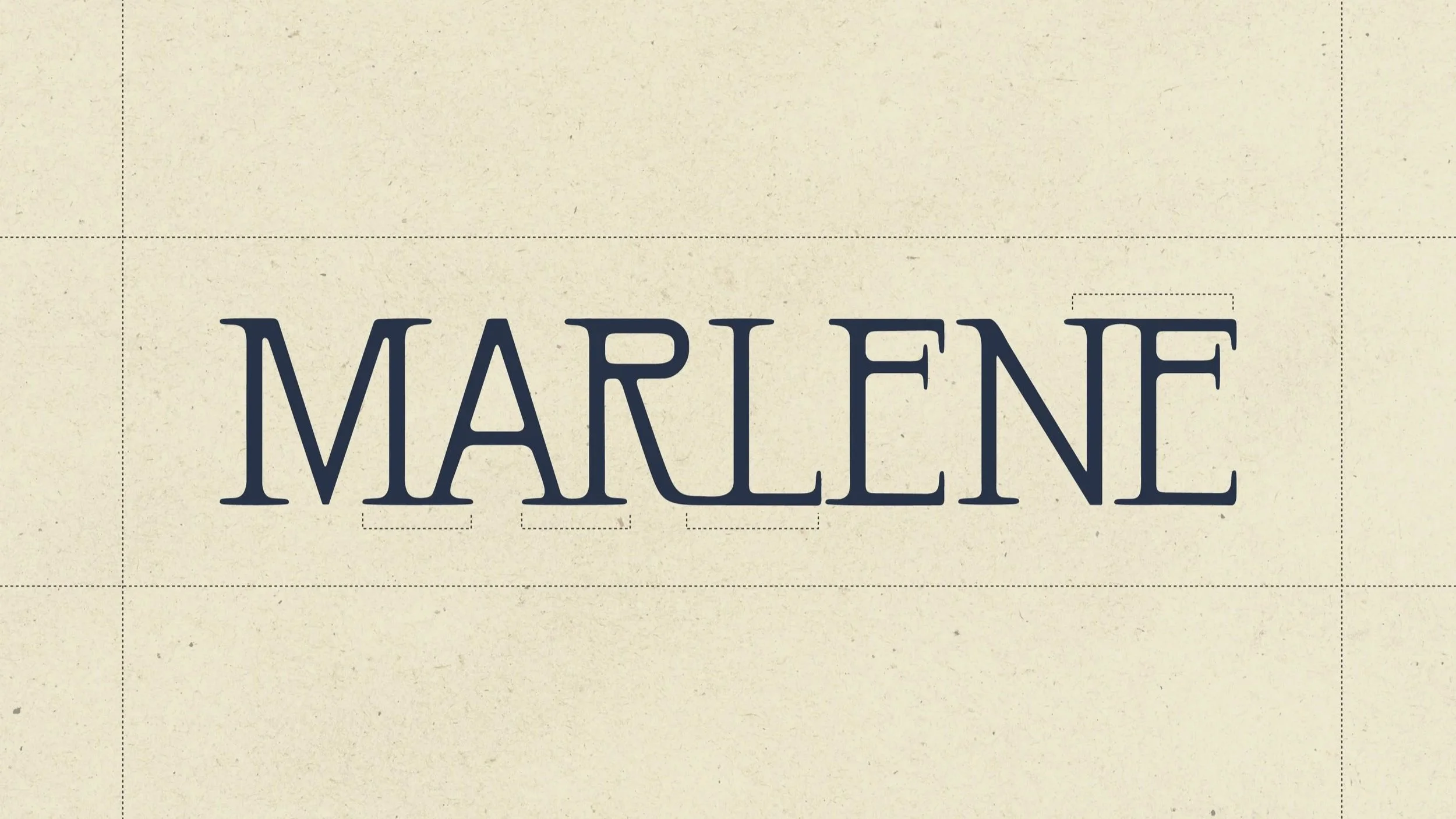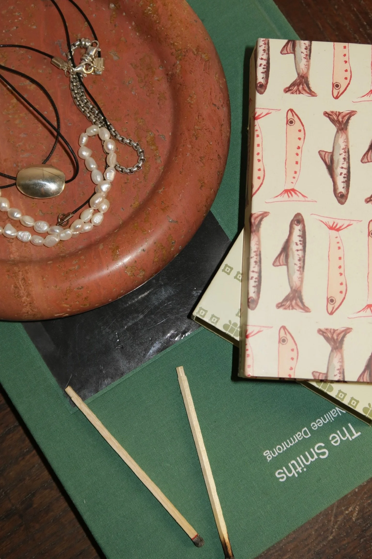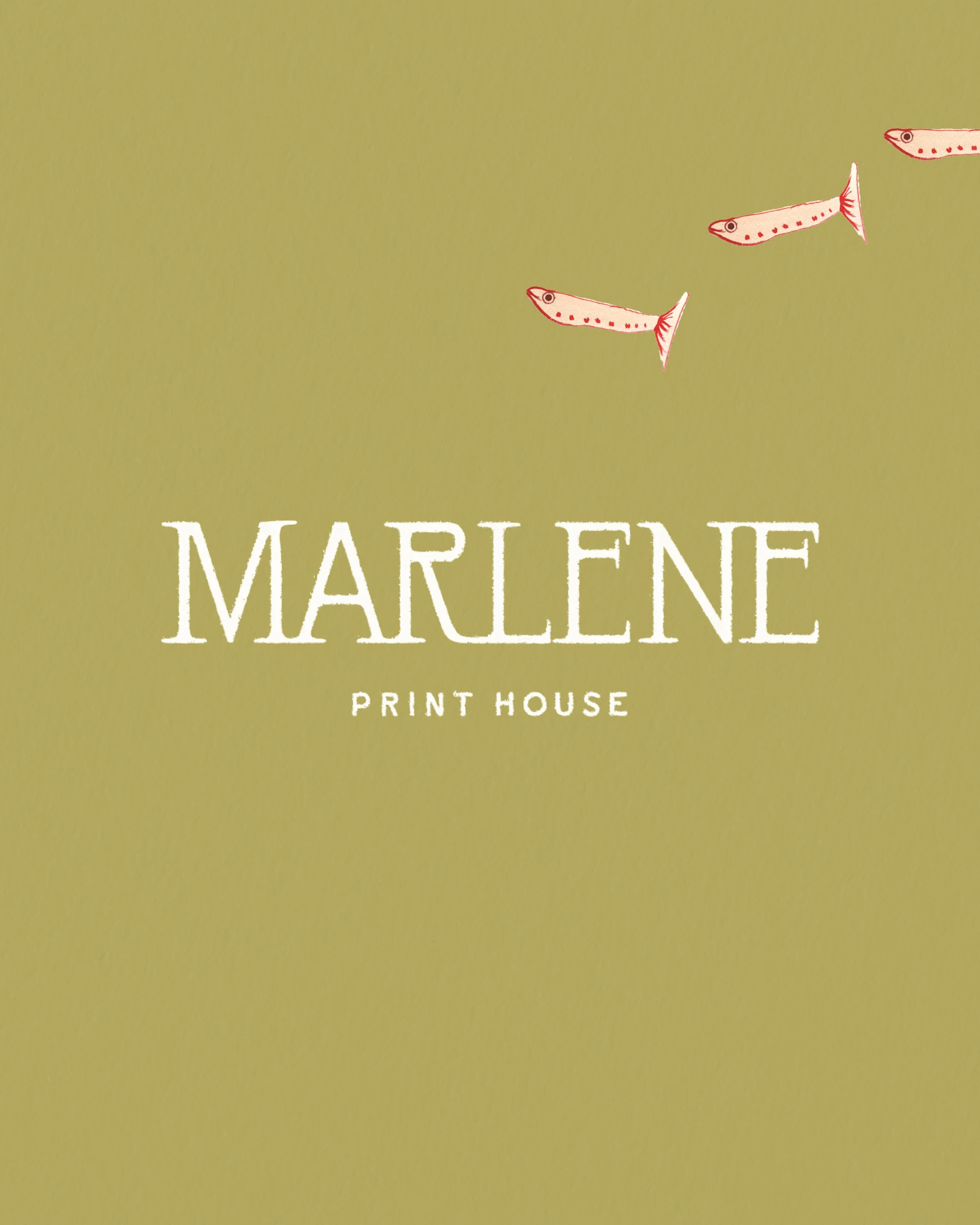
Marlene Print House
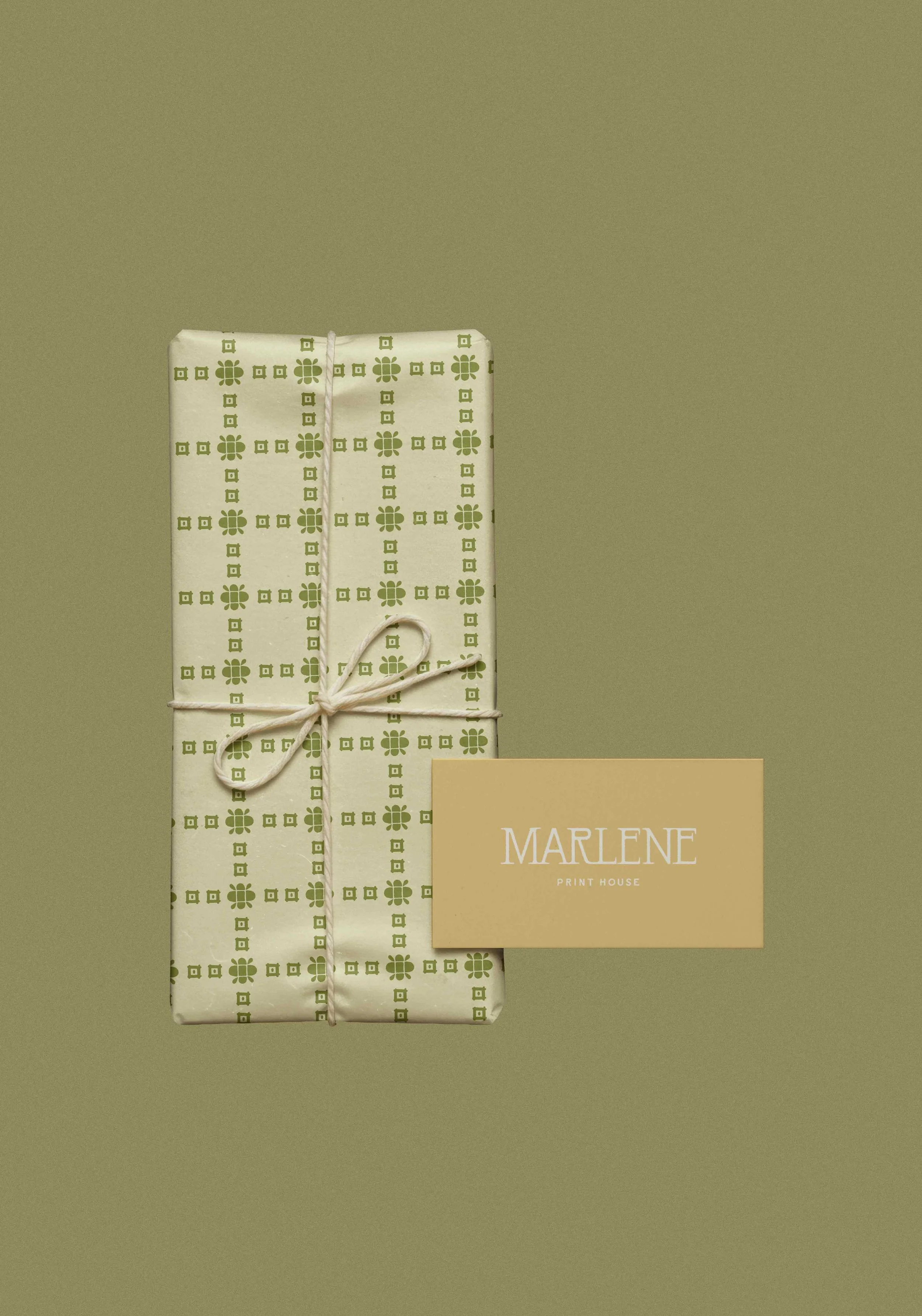
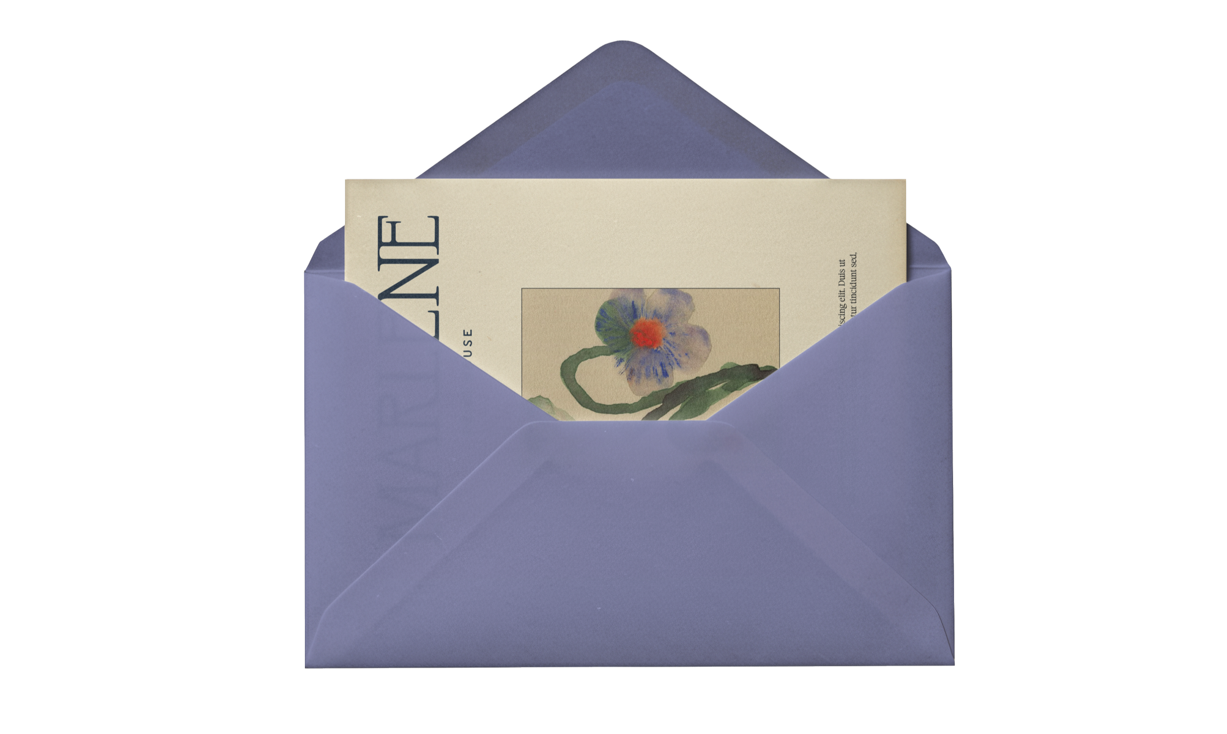
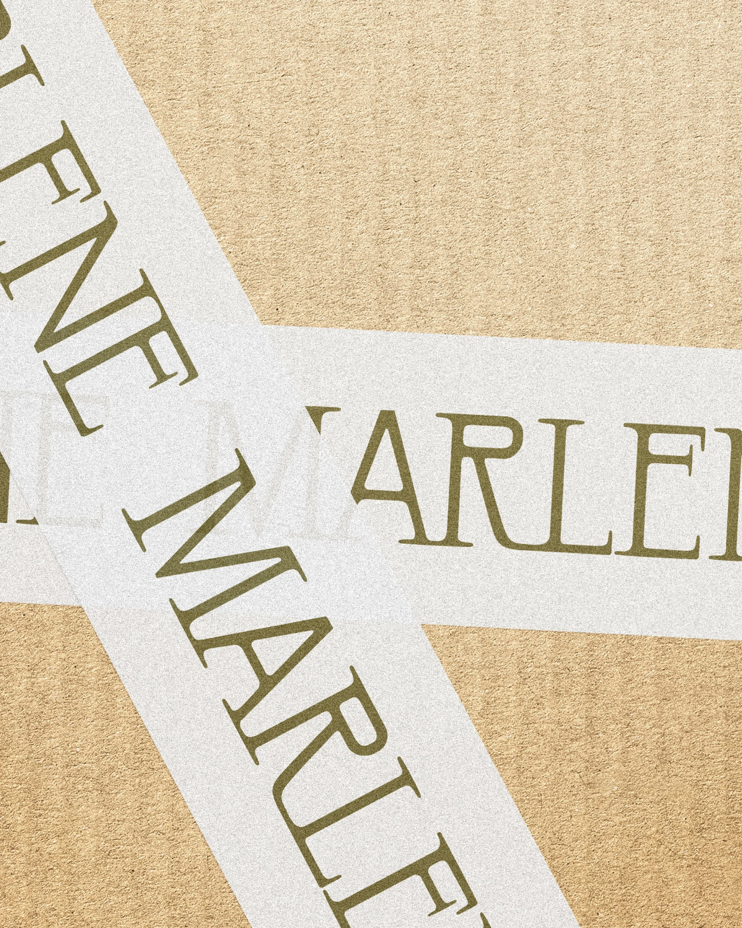
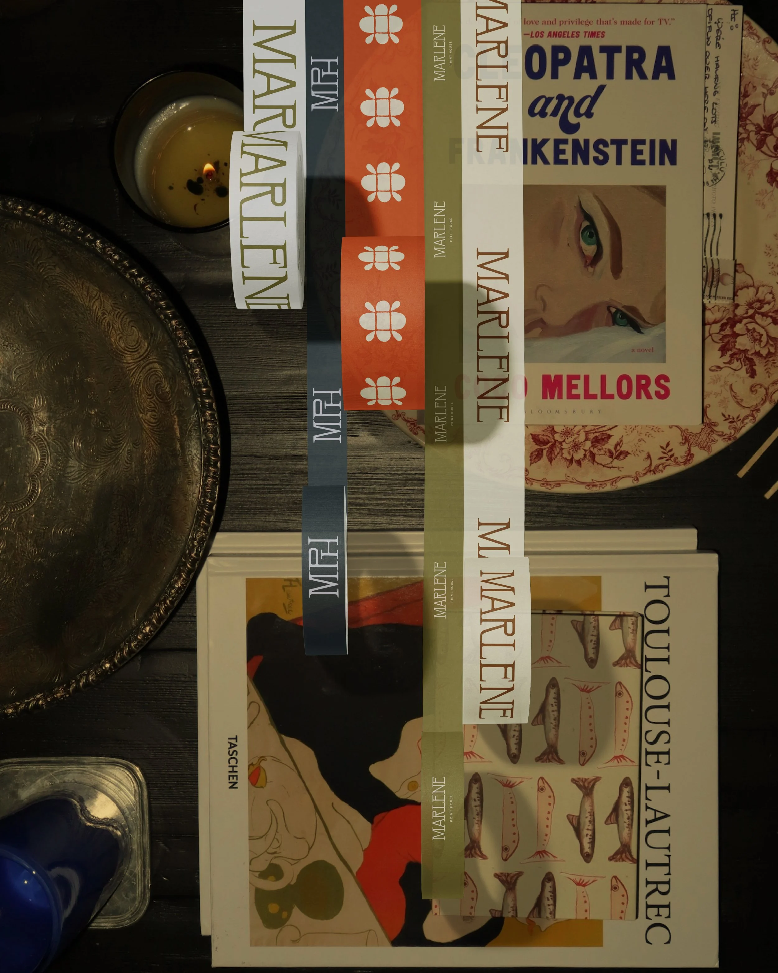
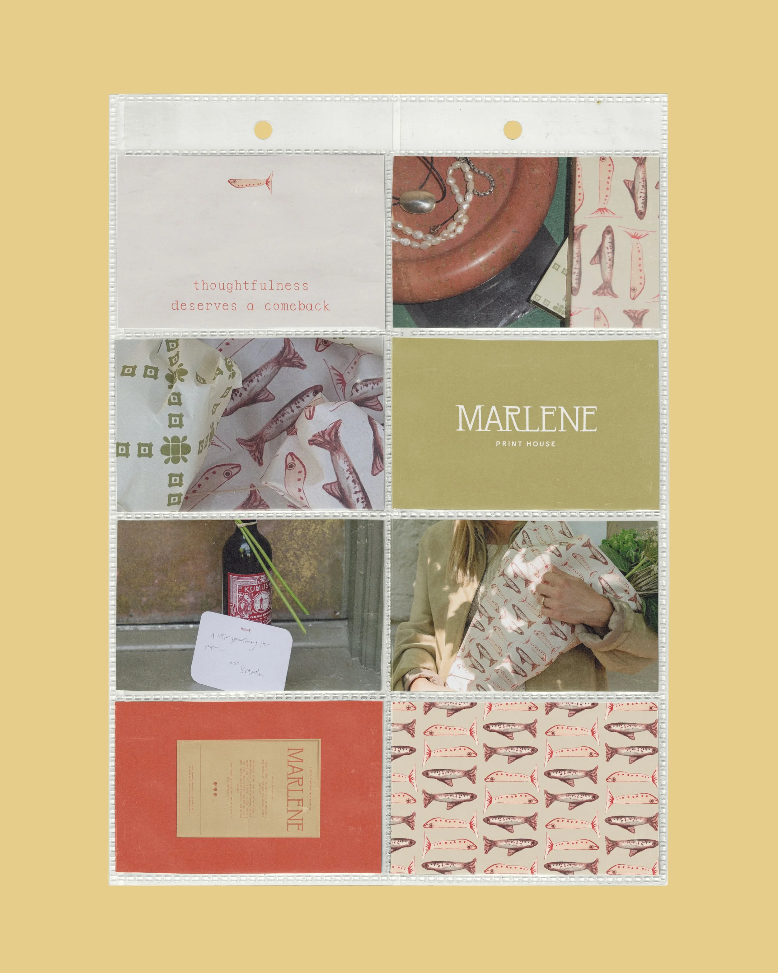
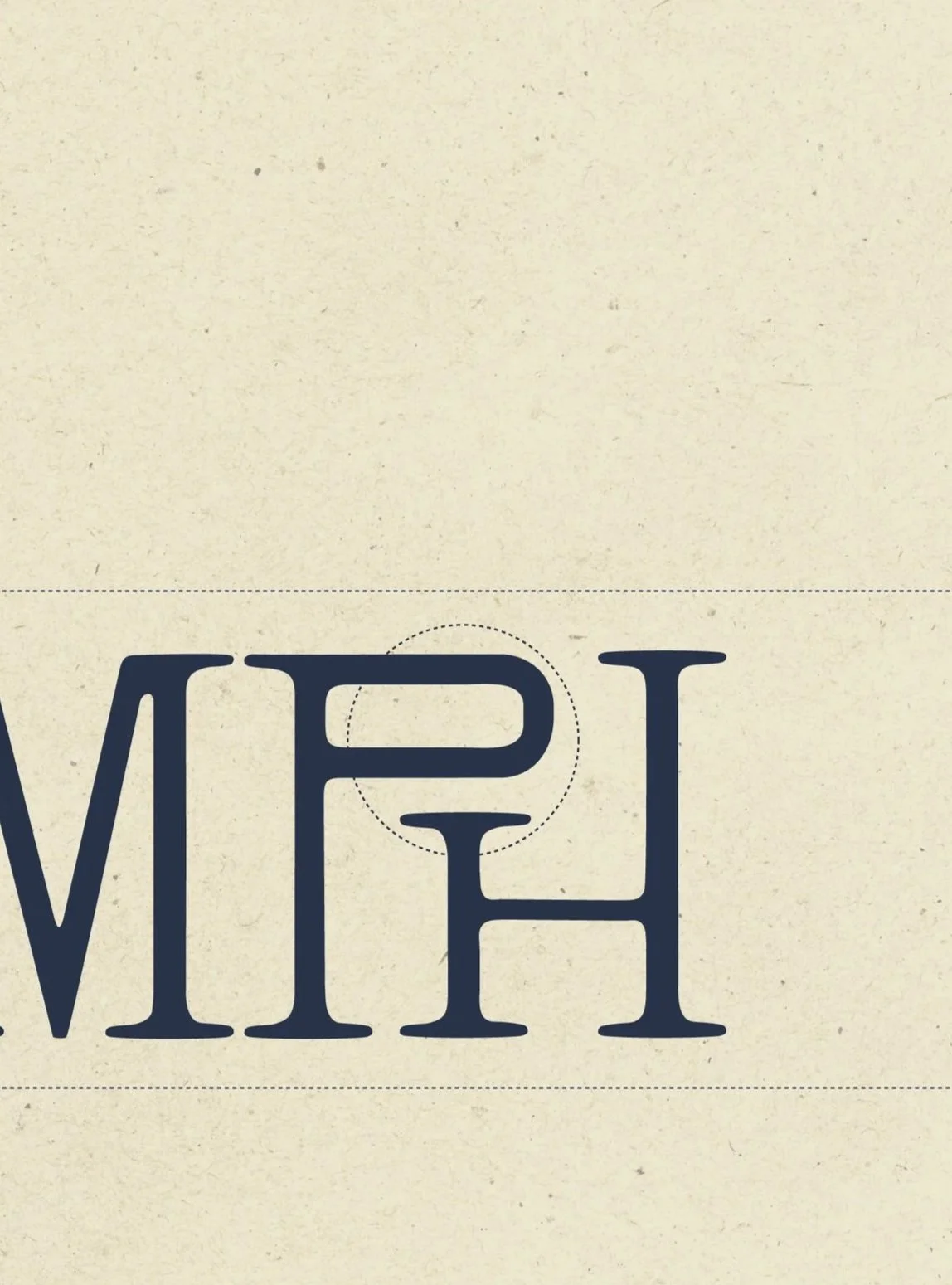
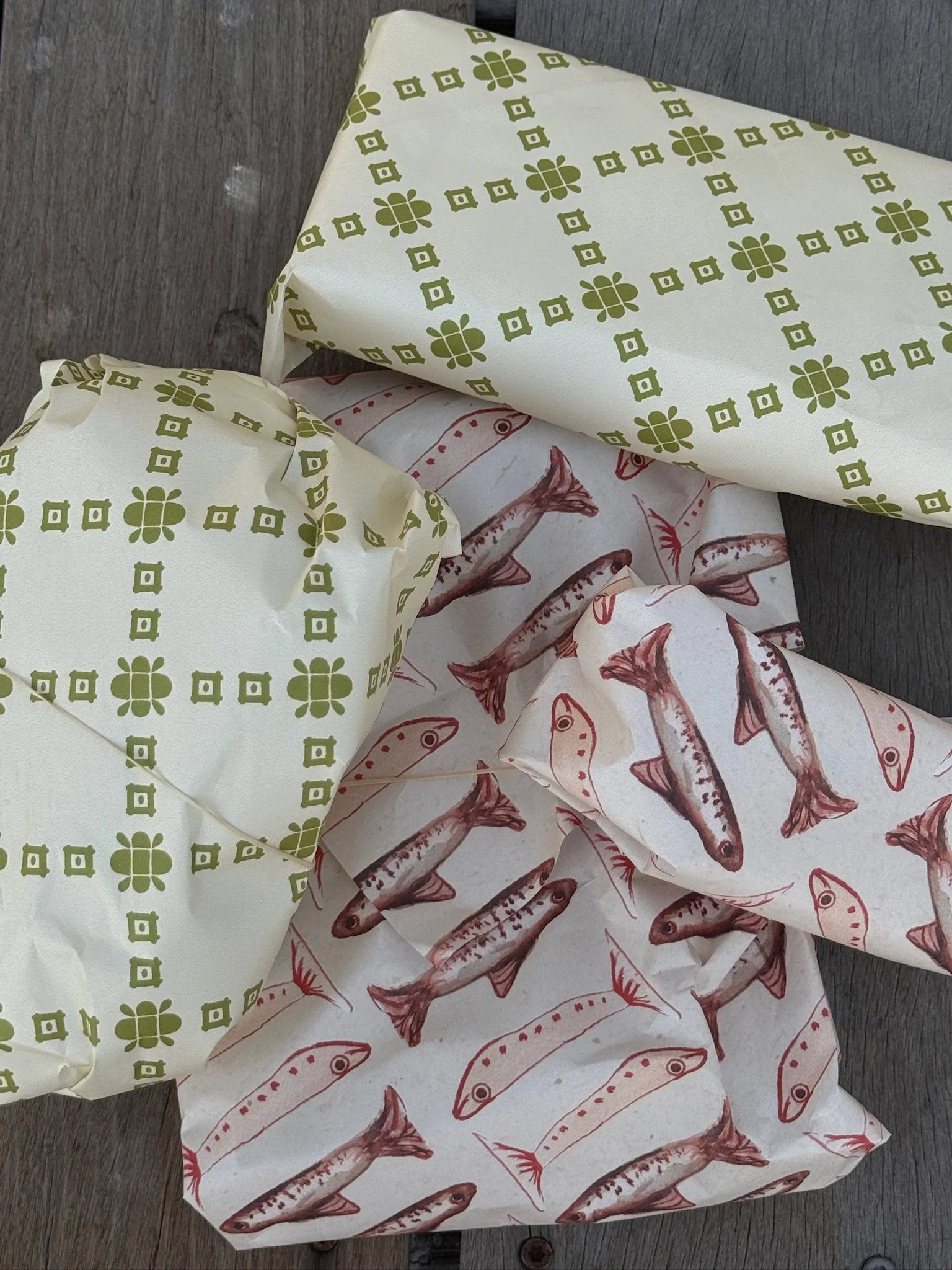
Marlene Print House was built on the belief that paper goods don't have to be throwaways. They can be the thing someone keeps. Studio Kinship developed the complete brand identity and Shopify website for founders Kelsey and Colbie, designing a world where every detail earns its place. The custom wordmark uses subtle letterform connections to evoke relationship and continuity. The type system pairs the hand-drawn warmth of Old Sock with the structure of Index Mono and the quiet readability of Open Sans. A palette of earthy unexpected hues like citronette, deep olive, cayenne, and iris brings personality without noise. Photo-forward and tactile in feel, the brand doesn't ask you to scroll a product page. It invites you into a scene.
servicesBrand Positioning
Visual Identity & Logo Design
Brand Assets
Brand Guidelines
Social Templates
Marketing Designs
Shopify Website
CreditsTable Talk | Brand Expression & Content Direction
Cotton Design | Illustration & Patterns
Ashley Teresa | Photography

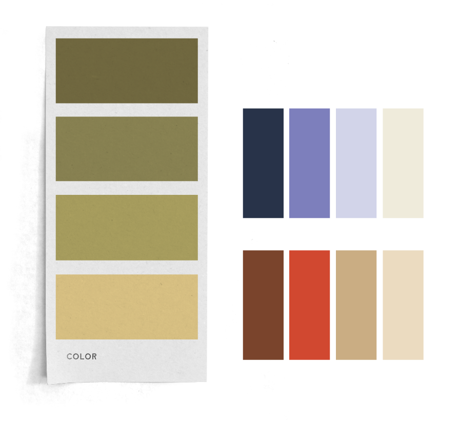
COLOR PALETTEThis palette captures the essence of Marlene: warm, expressive, and a lit tle unexpected — but always intentional. Grounded neutrals like Deep Olive, Terracotta, Taupe, and Linen bring a timeless, tactile feel that aligns with the brand’s keepsake quality, while playful tones like Deep Navy, Iris, Lilac, Mustard, and Citronette add just the right pop of personality. The result is a balanced blend of soft and bold, classic and off beat — a palette that feels both elevated and easy. Ever y color was chosen to evoke feeling, create contrast, and add character without ever trying too hard — much like the pieces themselves.