Mother’s Daughter
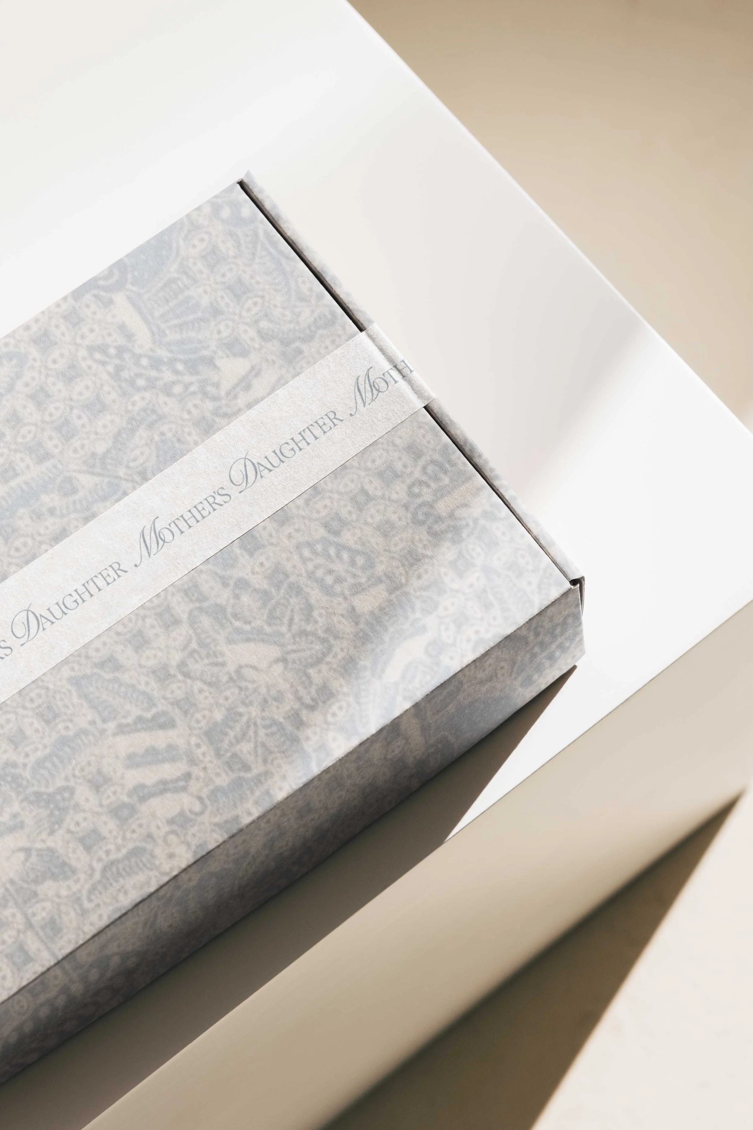
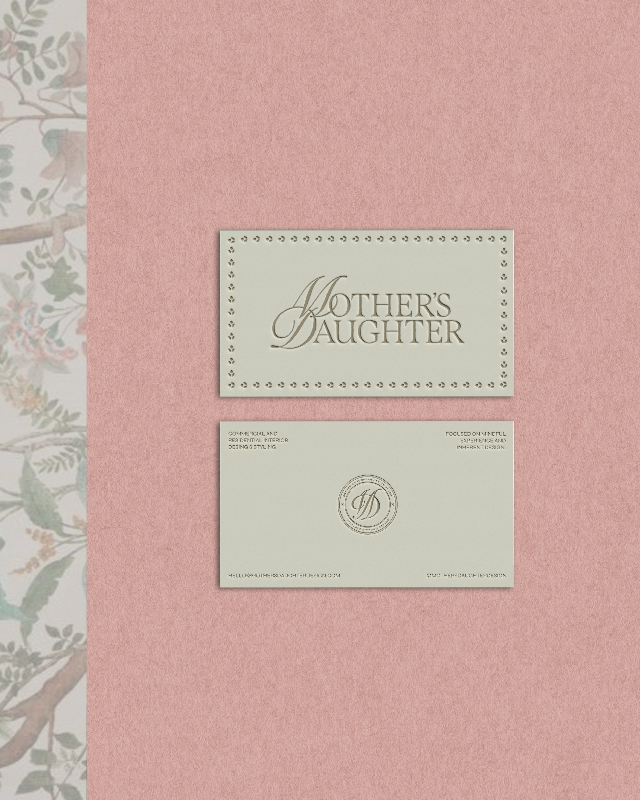
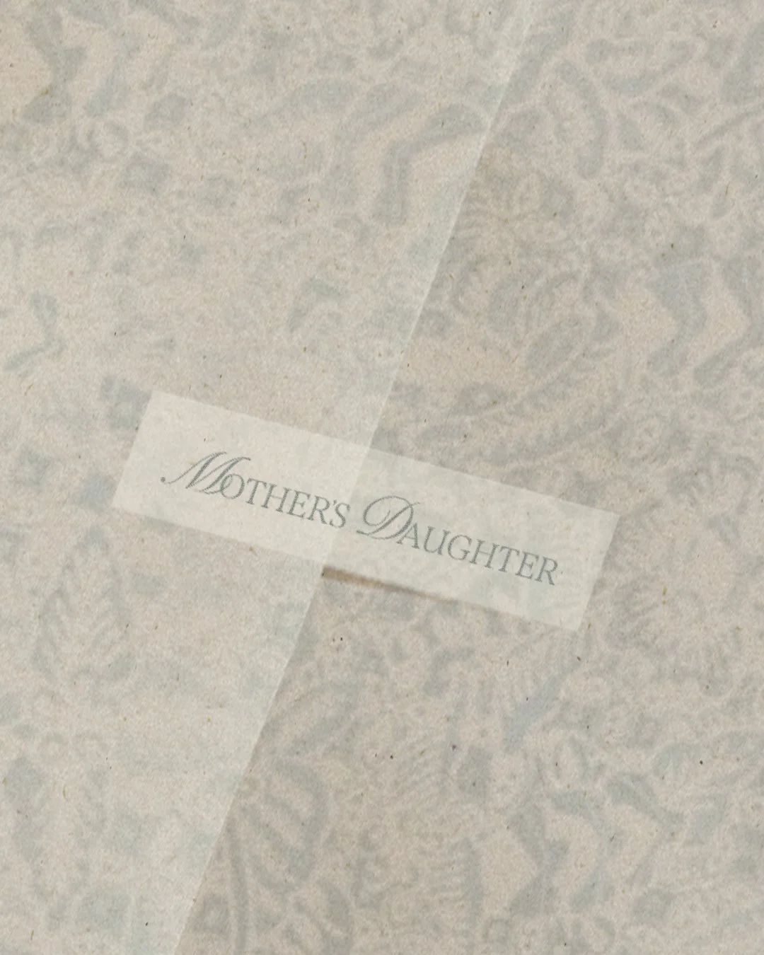
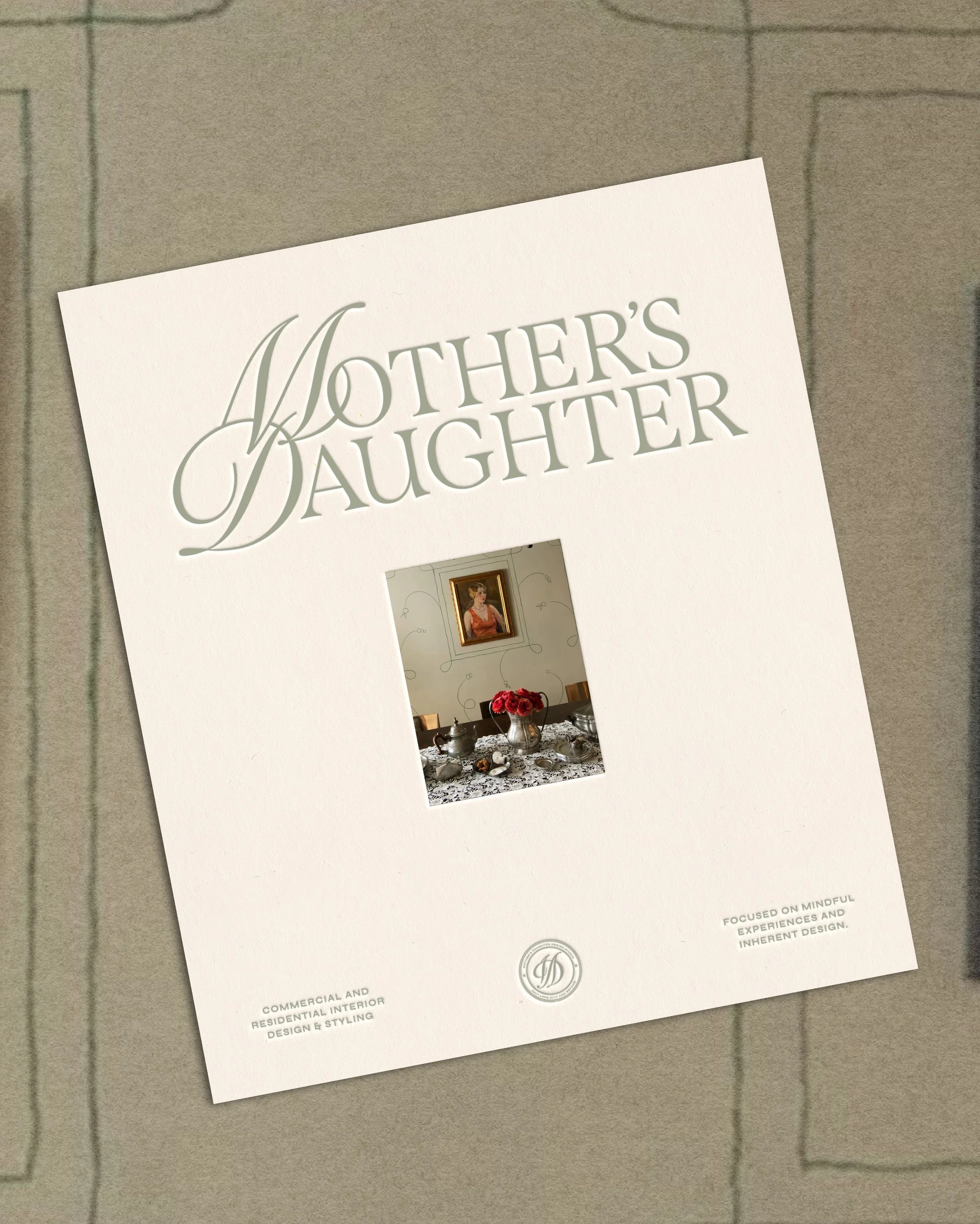
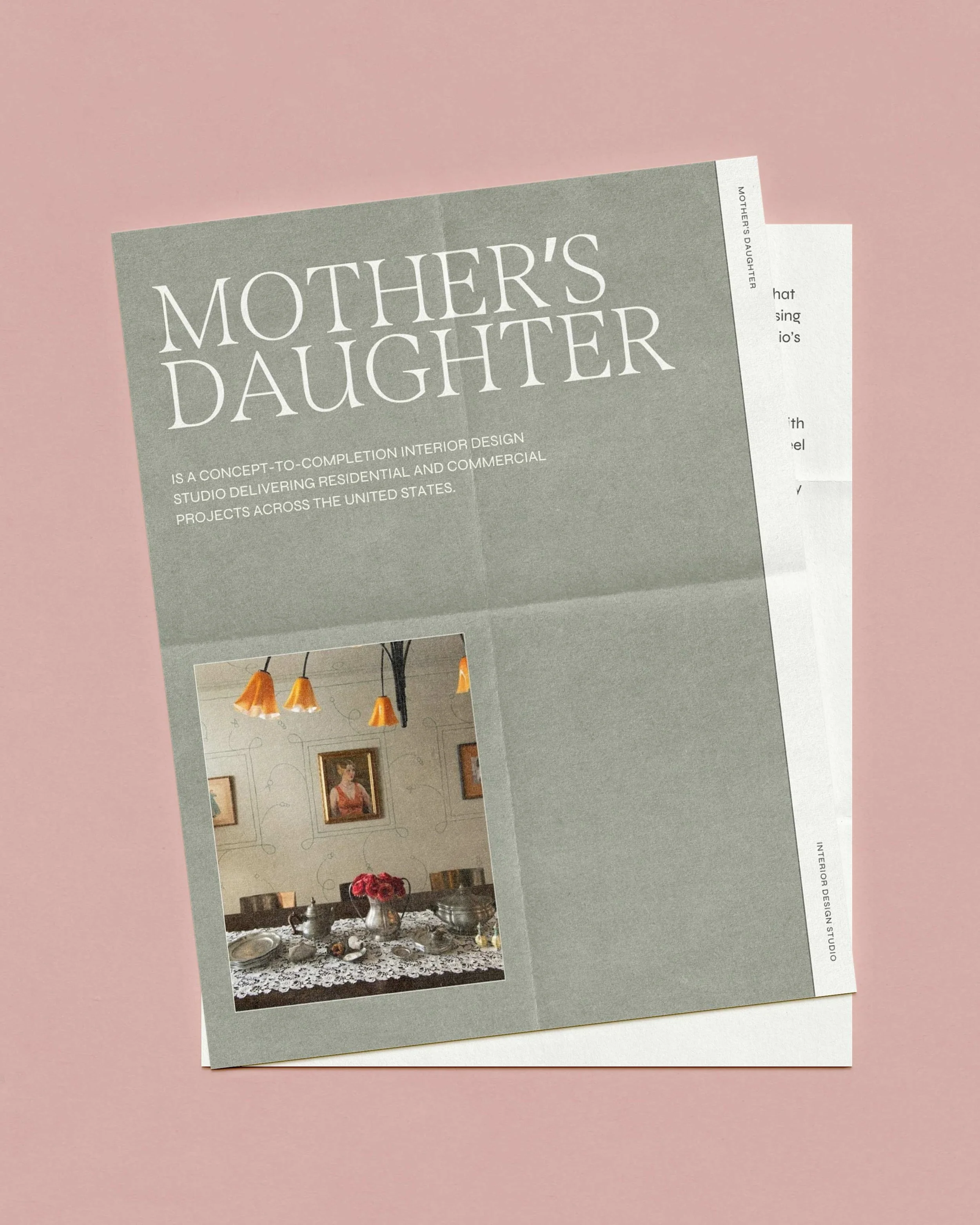
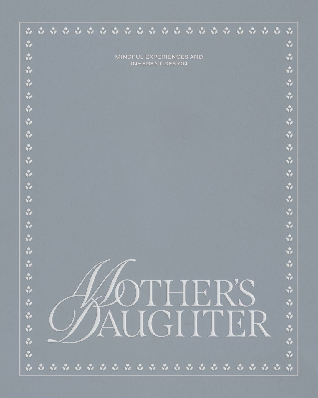
Mother's Daughter is Olivia's commercial and residential interior design studio, and its name is also its origin story. Olivia came to design the way some people come to a family recipe, by growing up inside it. Her mother and grandmother were both designers, and this studio is how she carries them with her, honoring everything they taught her while making the work genuinely her own. We anchored the whole identity in one quiet word she kept coming back to: inherent, the belief that good design doesn't impose a look, it uncovers what's already there. That idea shaped a logotype where a flowing script settles into a softer, classic serif, the two generations meeting in a single gesture, held together by a palette that lives between memory and the present, willow and blush threading gently back to the past while slate blue keeps it all calm and grounded. The result is a brand that feels like Olivia, rooted enough to honor the women who came before her, and warm enough to be wholly her own.
servicesBrand Strategy & Positioning
Visual Identity & Logo Design
Brand Guidelines
Proposal & Workflow Templates
Website
CreditsTable Talk | Brand Expression & Content Direction
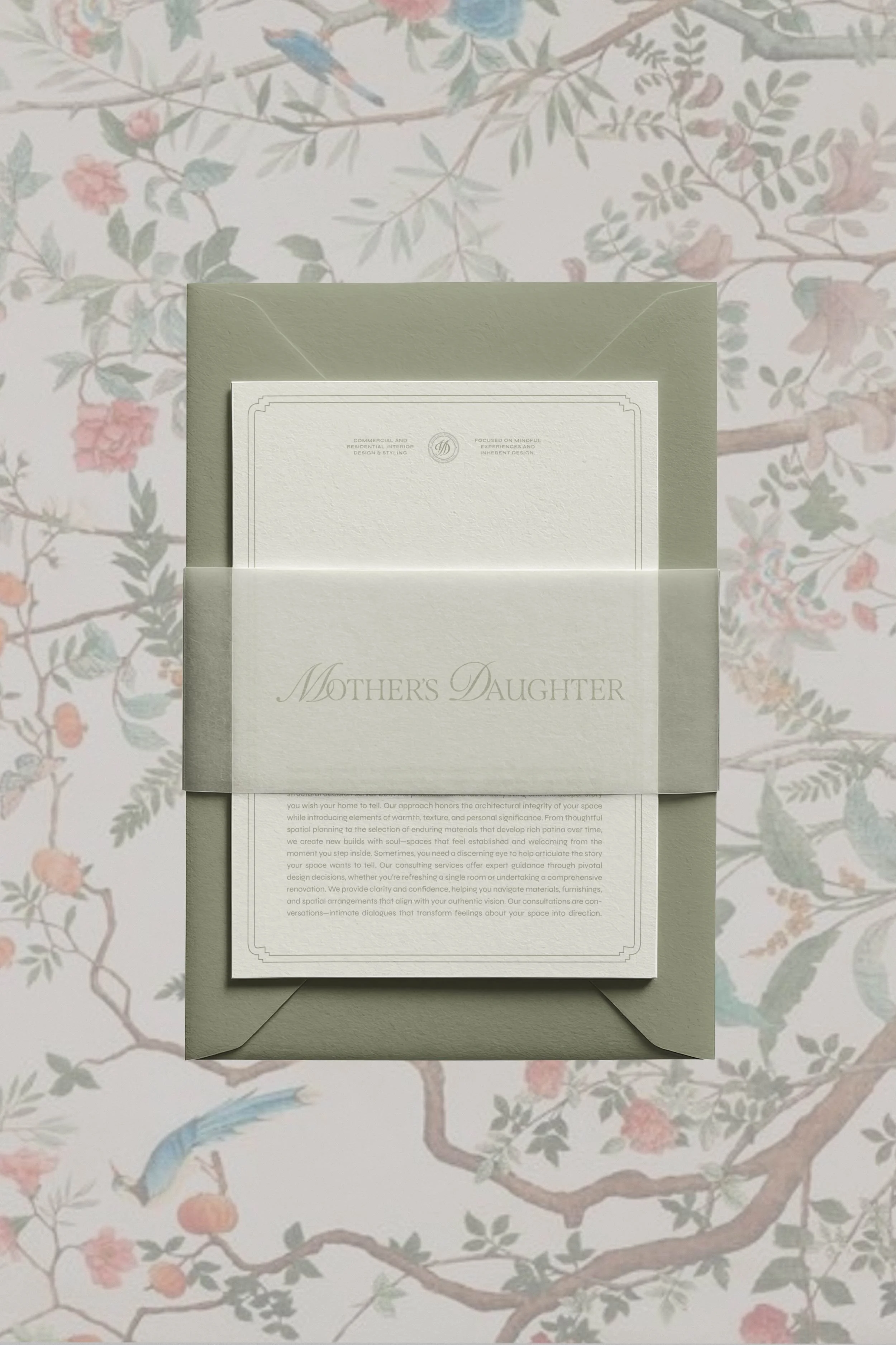
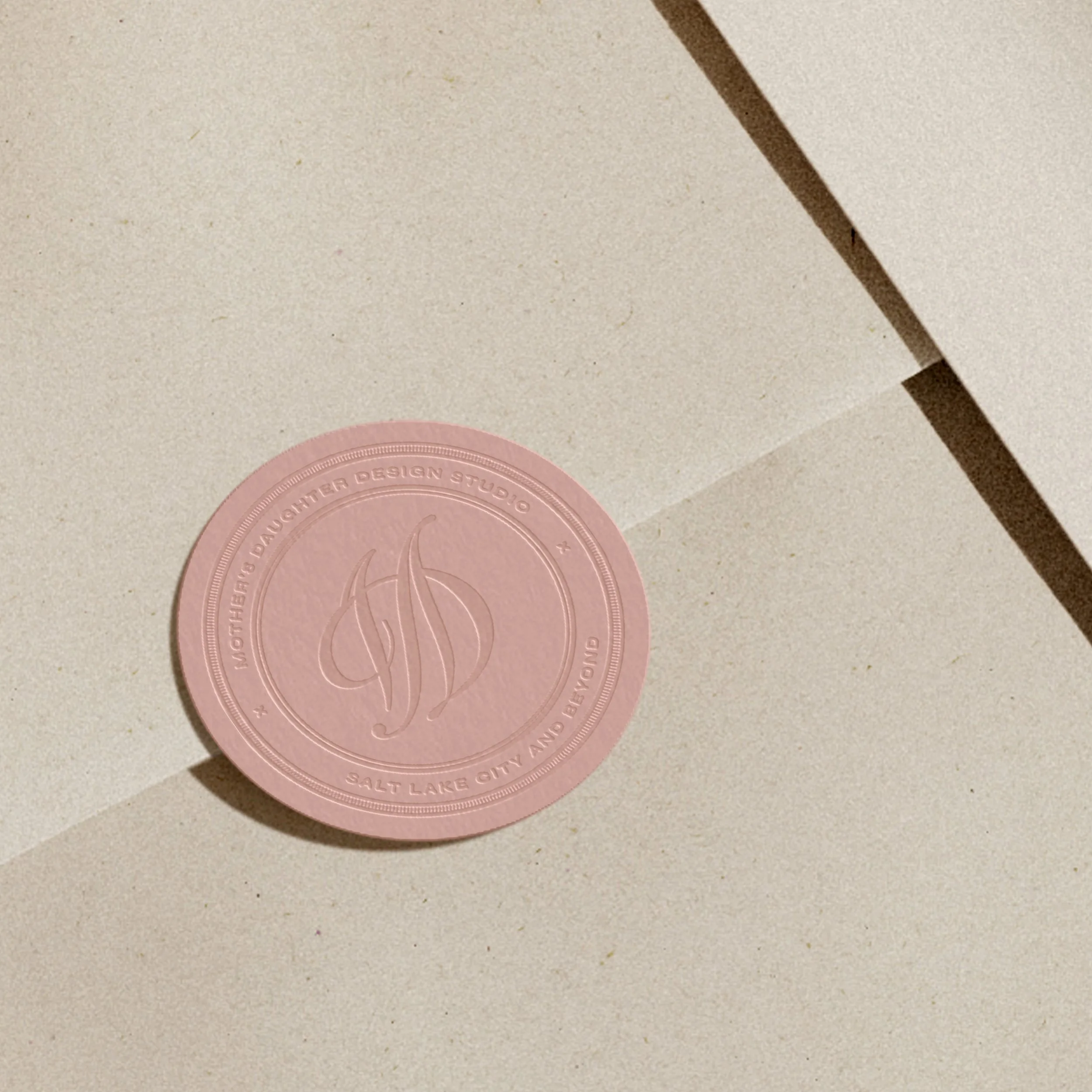
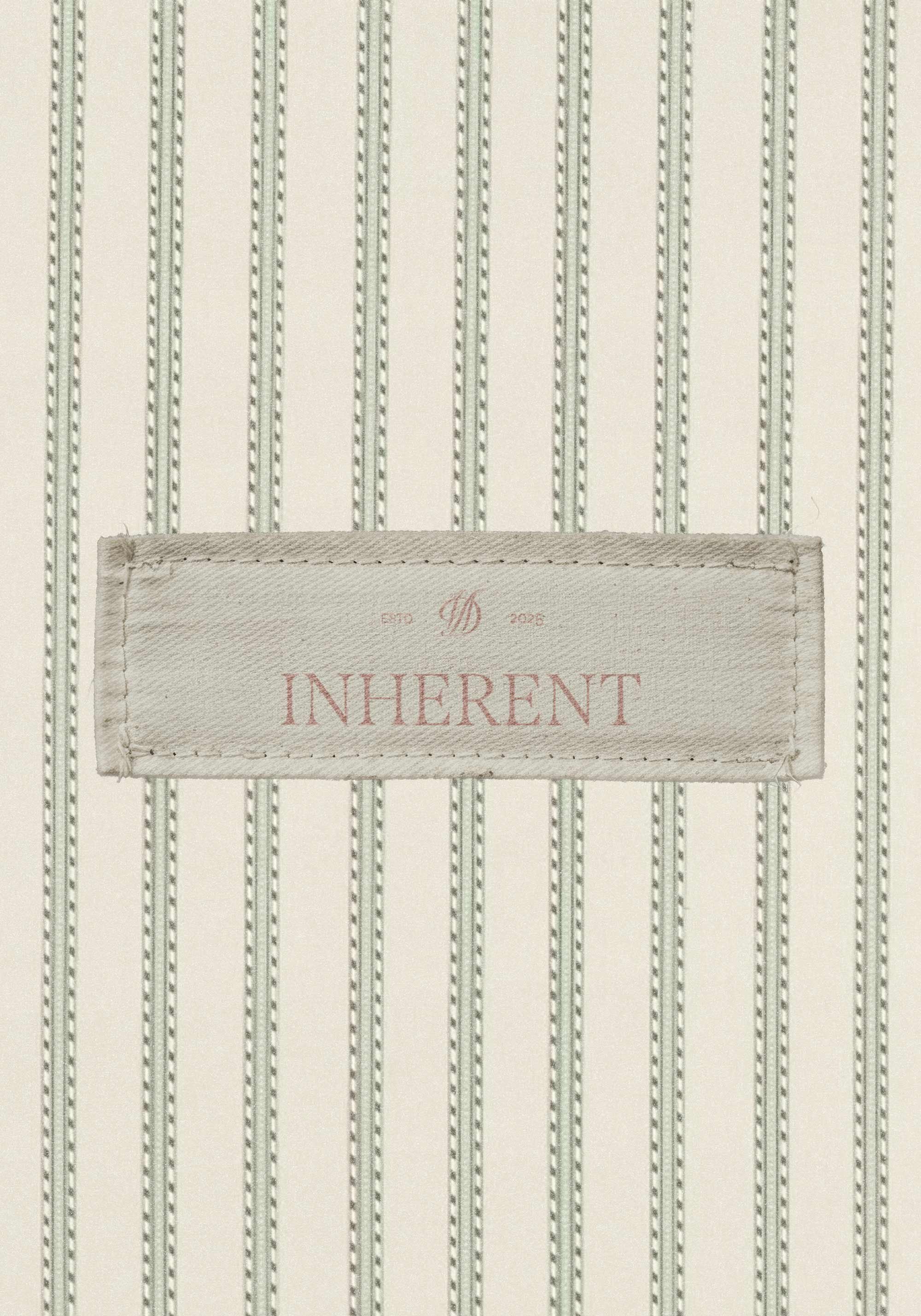

The palette lives between memory and the present, each color carrying a little of Olivia's story. Willow, a soft sage green, grounds everything in something authentic and lived-in, the calm, rooted heart of the brand. Blush threads a romantic line back to the past, warm and nostalgic without ever tipping into sweet. And slate blue keeps it all composed and quietly contemporary, the steady, trustworthy note that lets the softer tones breathe, while midnight and ivory round things out for contrast and light.
Color Palette