DWELL STREET
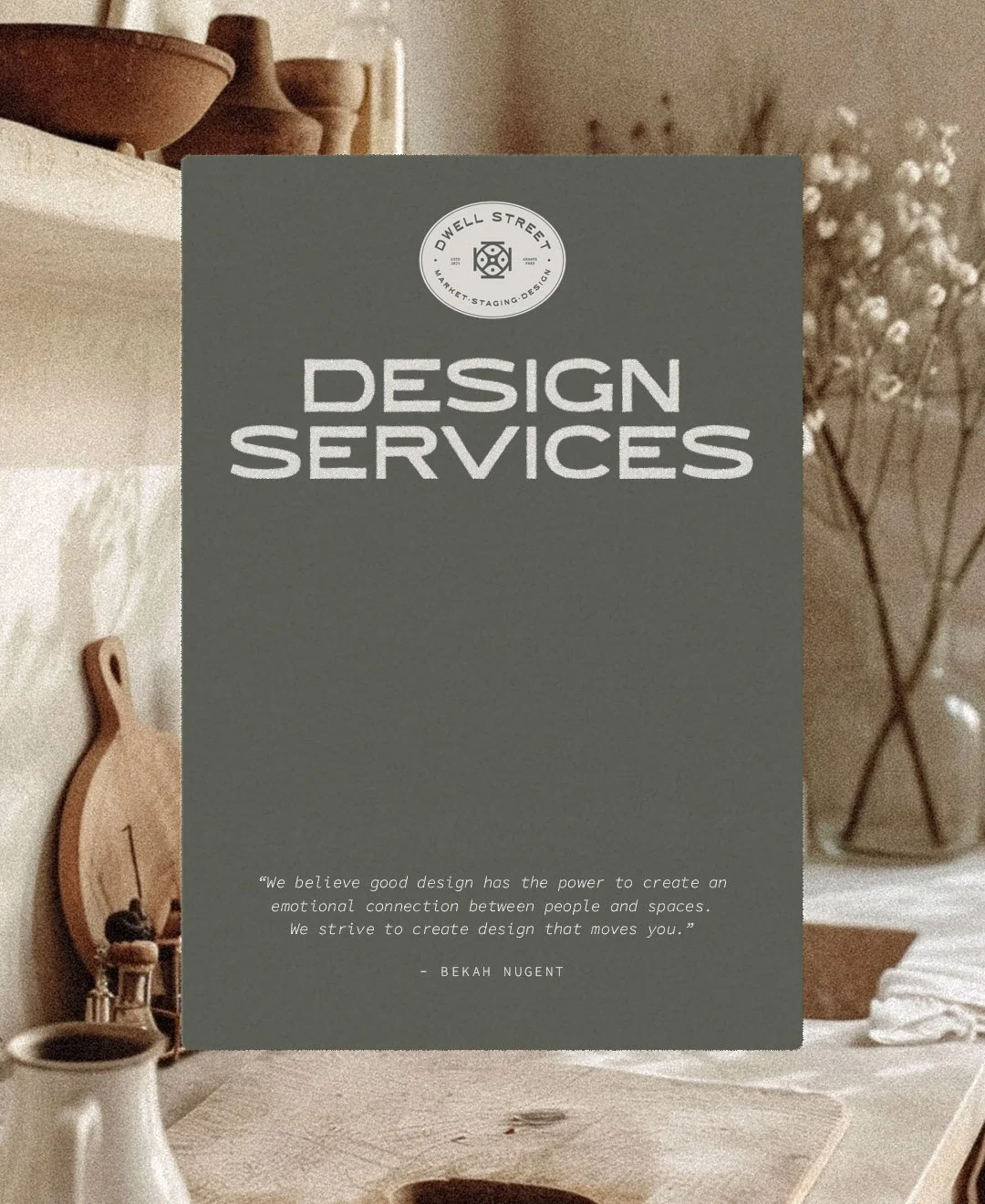
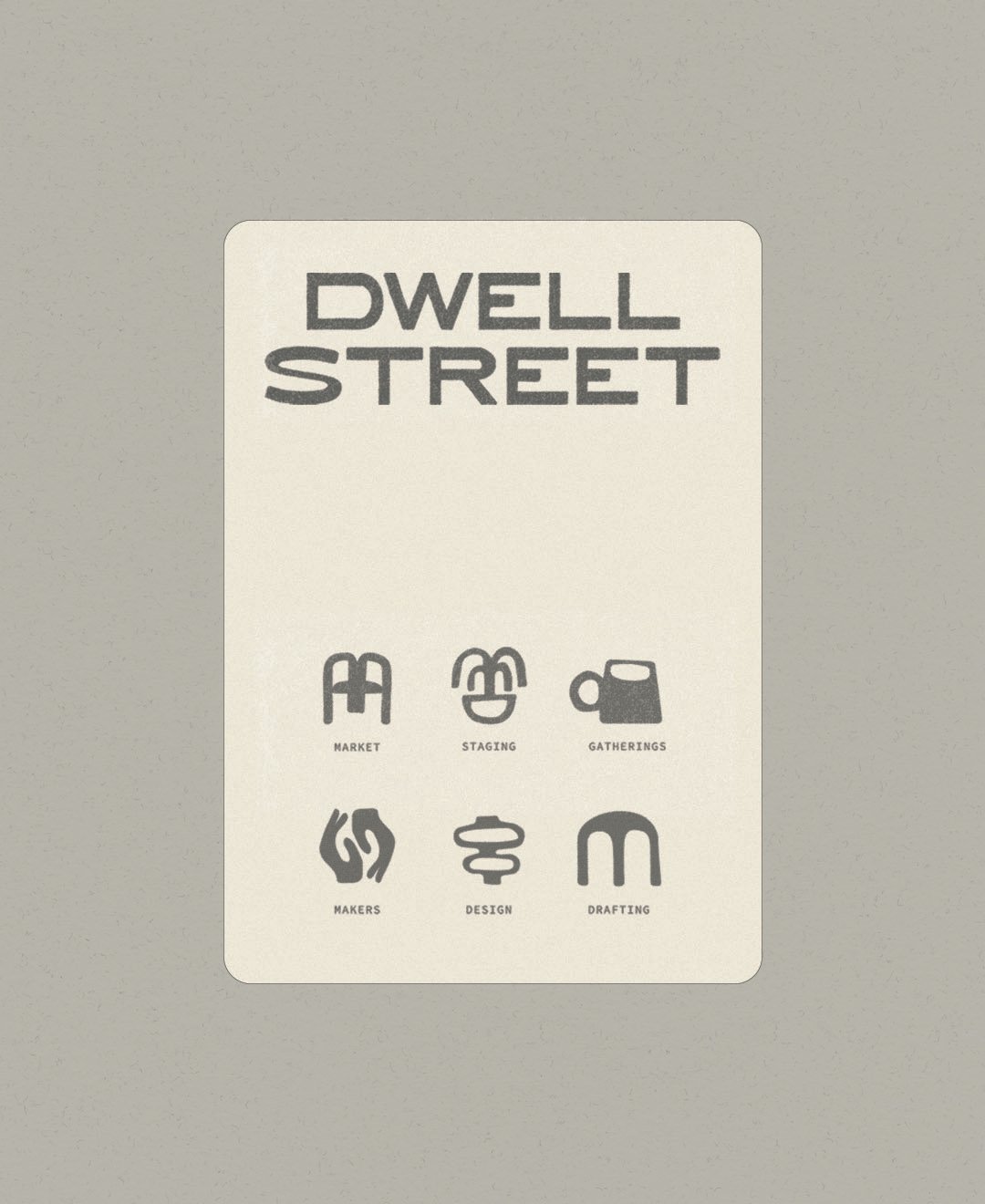
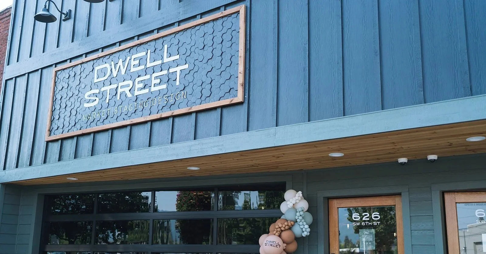
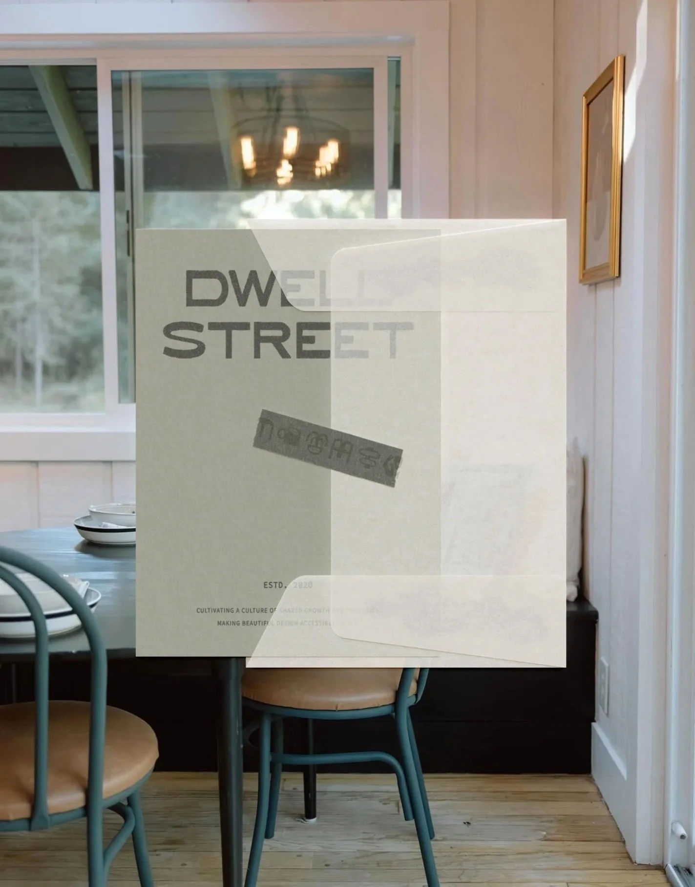
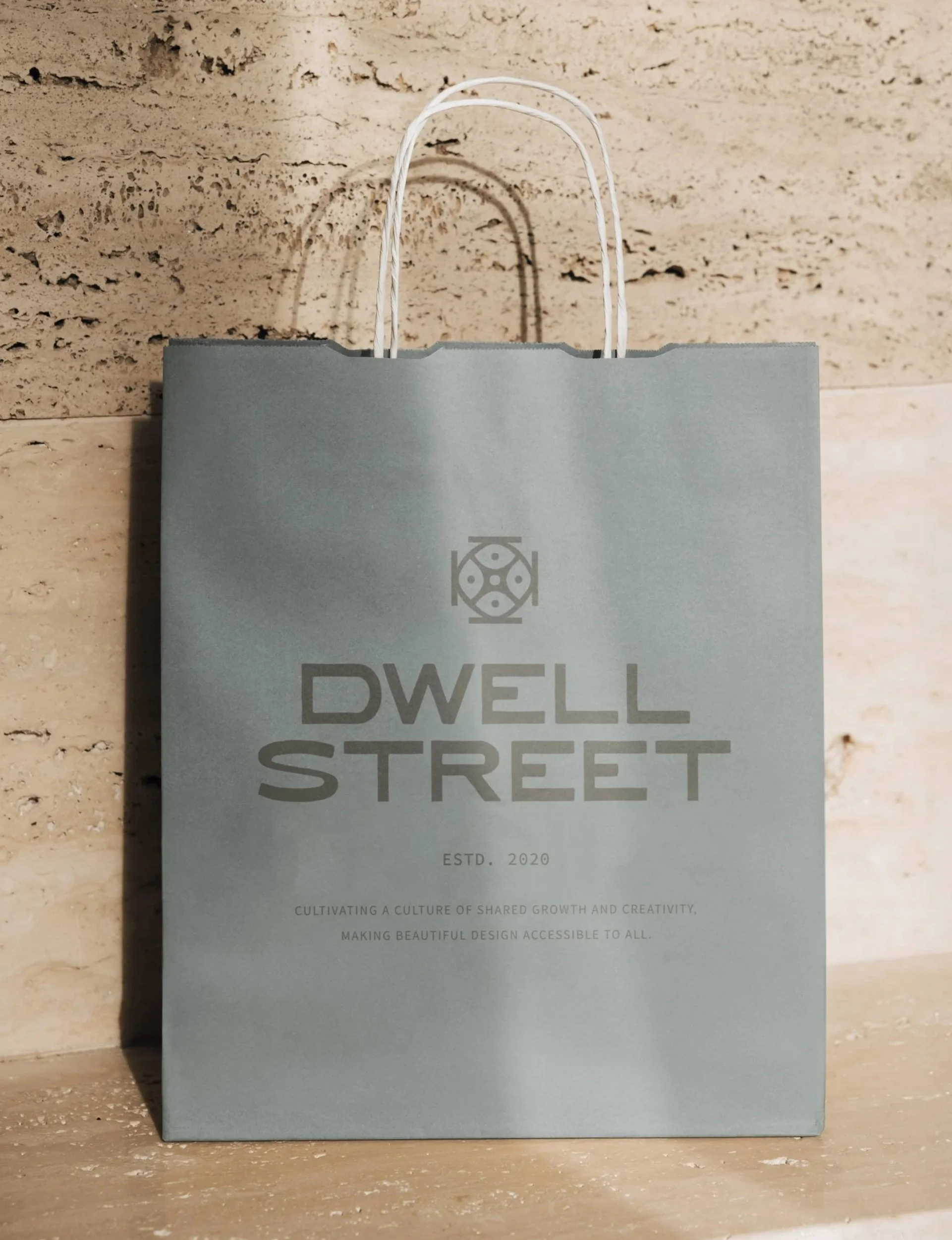
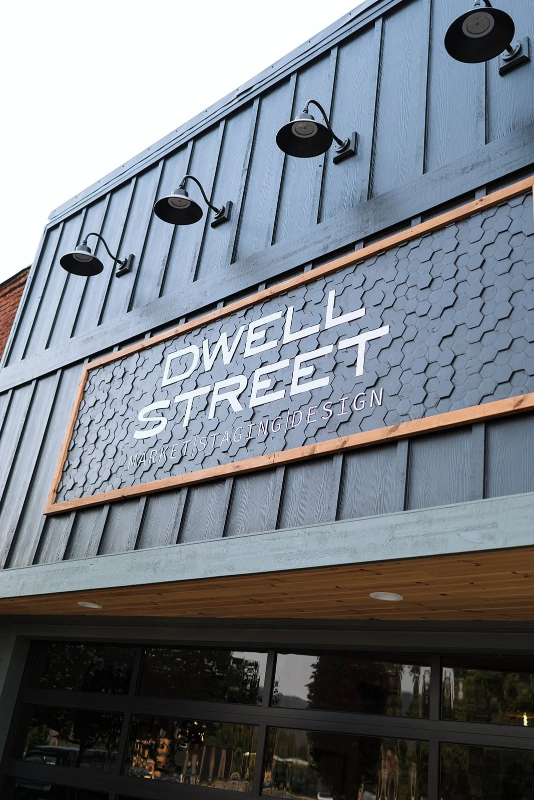
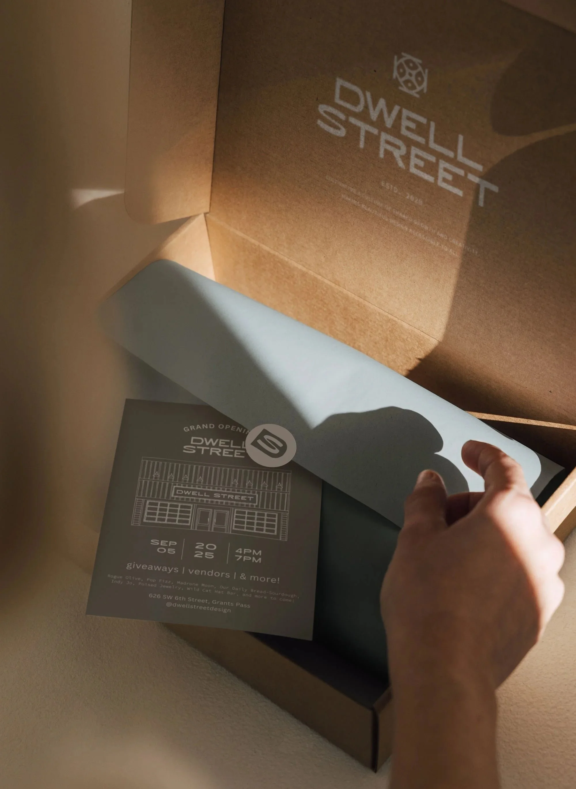
Dwell Street is a home goods market, staging, and design studio built on a simple, generous belief: that beautiful design should belong to everyone, not just the few who can afford it. Rooted in its Grants Pass community and a genuine love of local makers, it brings market, staging, and design together under one warm roof, the kind of place that feels less like a storefront and more like a gathering. We anchored the identity in that same spirit of approachability, drawing on vintage mercantile charm and an easy mid-century sensibility to create something that feels welcoming the moment you see it. The wordmark, set in a bold but softened type that nods to the hand-painted signs of old general stores, holds that balance of craft and ease, while a hand-drawn icon, quietly echoing the harmony and connection of a Sri Yantra, gives the brand a mark that feels made rather than manufactured. The result is a brand as grounded and unpretentious as the community it serves, eclectic, thoughtful, and open to all.
servicesBrand Strategy & Positioning
Visual Identity
Logo Design
Brand Assets
Brand Guidelines
detailsInterior Design | Industry
Rebrand
2026



THE CHALLENGE
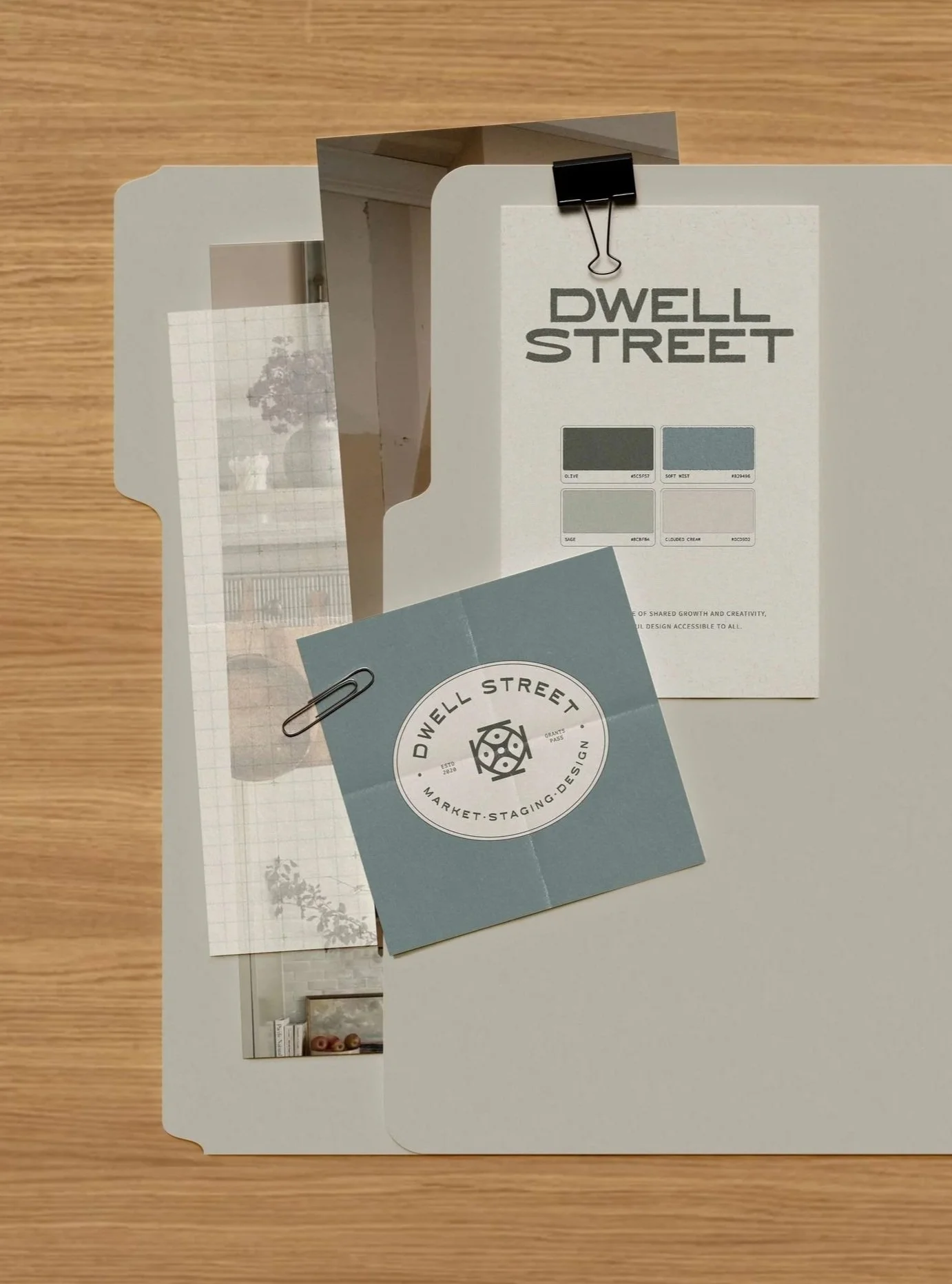
Create a brand for Dwell Street that felt as grounded and welcoming as the spaces and goods they bring to their community. The heart of the work was the mark itself. Its original concept drew from the Sri Yantra, a symbol of balance between the masculine and feminine, and while the meaning was beautiful, the form felt too rigid for a brand built on warmth and approachability. The challenge was to honor those roots while shaping something that felt timeless, soft, and genuinely inviting, a brand that made beautiful design feel accessible to everyone, not just the few.
THE APPROACH
We started with what already held meaning, and gave it room to breathe. The Sri Yantra stayed as the foundation, but I began to simplify, removing the harsh edges, reshaping the rigid triangles into organic, eye-like forms, and softening every line until the symbol felt crafted by hand rather than constructed. That same instinct carried through the rest of the identity. The wordmark, set in a bold yet rounded type reminiscent of hand-painted mercantile signs, balances modern clarity with vintage charm, while an earthy, lived-in palette grounds the whole brand in the natural, unpretentious spirit Dwell Street is known for. Every decision came back to the same three values: creativity, harmony, and connection.
THE RESULTS
A brand that feels exactly like the place it represents, warm, eclectic, and open to all. An icon that holds real meaning without ever feeling stiff, and a visual identity as grounded and approachable as the community Dwell Street was built to serve. This is what happens when a symbol is allowed to soften into something that finally feels like home.